How to Improve Project Planning With an Online PERT Chart
November 5, 2025 / Estimated reading time: 15 minutes

Audio version:
If you intend to start a career in project management, you’ll become familiar with a PERT chart. It will help you plan projects from beginning to end.
This type of project management charts has been utilized for more than 60 years and has stood the test of time.
In this article, we explore what a PERT chart is, how it works, and why it is considered an indispensable part of the planning process.
Contents:
- What is a PERT chart?
- How does it work?
- When to use a PERT diagram?
- Pert chart calculation.
- Pert diagram examples.
- How to create a PERT chart.
- Advantages and disadvantages of this tool.
- PERT chart makers.
- PERT chart vs. Gantt chart.
PERT stands for Program Evaluation Review Technique. However, this clarification is not enough for a general understanding, so let’s move on to the PERT chart definition.
What is a PERT chart?
A PERT chart is a visual network diagram used to represent a project timeline. It helps to estimate your project duration based on the analysis of task sequences.
The chart was designed by the U.S. Navy in 1957 in order to plan the building of the Polaris nuclear submarine. Frederick Taylor is a founder of the Program Evaluation Review Technique. He strived to find a handy system to organize and manage complex objectives.
This chart was applied in large-scale projects where time is the major factor and allows for scheduling projects without knowing the details and durations of all activities. For example, it was used in planning the 1968 Winter Olympics in Grenoble. It provided the organizators with the in-depth analysis of all the Games activities and processes before the kick-off date.
Businesses all over the world implement this time management technique together with Work Breakdown Structure examples and the MoSCoW method to boost their processes and affairs.
How a PERT chart works
What is a project plan without good visualization? The answer is not encouraging for sure. Therefore, the role of a handy chart should not be underestimated.
What is the purpose of a PERT chart? Project teams work with this tool to break down certain tasks that compose a project and analyze the time it will take to complete each of them. It also assists in identifying the minimum amount of time PMs need to complete their projects as a whole.
A PERT system includes arrows, circles, rectangles, or tables that reflect project tasks and the overall schedule. They can be top-level and demonstrate only the key project stages or show more detailed steps.
There are also nodes that are connected by lines or vectors, which represent various tasks. We have recently written about the similar structure to describe a critical path method.
When an arrow is drawn from task A to task B, it means that the first task must be completed before the second one. You are free to add parallel activities that can be located at the same production phase but on different task lines. They won’t be dependent.
At its simplest, a PERT diagram helps you to:
- Anticipate time it’ll take to complete a project.
- Find opportunities for project optimization.
- Make right decisions about complex activities.
- Find a critical path to complete your project.
Now let’s get more details about when and where this diagram performs.
When to use a PERT chart?
This chart seems appropriate when you need to map out a timeline, estimate the critical path of a project, and evaluate the required resources.
Use PERT to:
- Define a critical path. One of the benefits of PERT chart project management is that the diagram provides the ability to define a critical path. This actually differs it from many other charts. It is also essential for visualizing the overall project timeline.
- Estimate the time spent. A PERT diagram estimates the duration of individual tasks and the entire project, so it can be applied when you need to define the expected duration even at the project planning phase.
- Assess resources. You will be able to understand which tasks require resources and which don’t. This info will help to save the time of all interested parties.
In common words, a PERT diagram will play an essential role in case you want to get a handy project plan that can be easily shared with your colleagues.
The tool is commonly utilized across a wide range of spheres. Some of the uses include:
- Project management. It is pretty popular in this field as it ensures that the project follows the timeline.
- Website development. You can apply it to help schedule and track different tasks involved in creating a website.
- Software creation. It helps to design, create, analyze, and test software projects.
- Work package control. The system assists in tracking different work package controls in business operations.
- Educational programs. The diagram is also utilized to schedule and divide long-term educational programs.
PERT chart calculation
How to calculate a PERT chart?
The concept of this diagram relies on the weighted average of the numbers based on the most pessimistic, most optimistic, and most likely estimates for the project length.
- Optimistic time (O) is the least amount of time you need to accomplish a certain task.
- Pessimistic time (P) is the maximum amount of time you need to accomplish an activity. This is the worst-case scenario.
- Most likely time (M) is the best estimation of how long it takes to accomplish a task (meaning that there are no challenges).
- Expected time (E) is the best estimation of how long it takes to accomplish a task, assuming there are some challenges.
Knowing these parameters you may logically ask about their calculation. There is a PERT chart formula that assists in doing it.
Using the O, M, and P time estimates, you can generate the formula to calculate the expected duration of your task. It may look like this:
(O + (4*M) + P) / 6
The weighted average you’ll get is the expected time. However, the calculation is often bent towards the pessimistic plot.
Using this formula, you’ll get the value that you will assign to the PERT chart arrows.
Let’s imagine a constructor working on building a private house. The optimistic time estimate is 120 days, the most likely time estimate is 180 days, and the pessimistic time estimate is 365 days.
The equation to figure out the PERT estimate will look like this: E = (120 + 4 x 180 + 365) / 6.
If everything is ok, the constructor will get a PERT estimate of 200.83 days to finish building the house.
When you have difficulties with equations, find a PERT calculator on the web to simplify the process.
PERT chart examples
To understand how it works, as an example, you can choose any Program Evaluation Review Technique diagram template, provided by popular project management scheduling software solutions. However, first, consider the types of the possible PERT chart templates and examples.
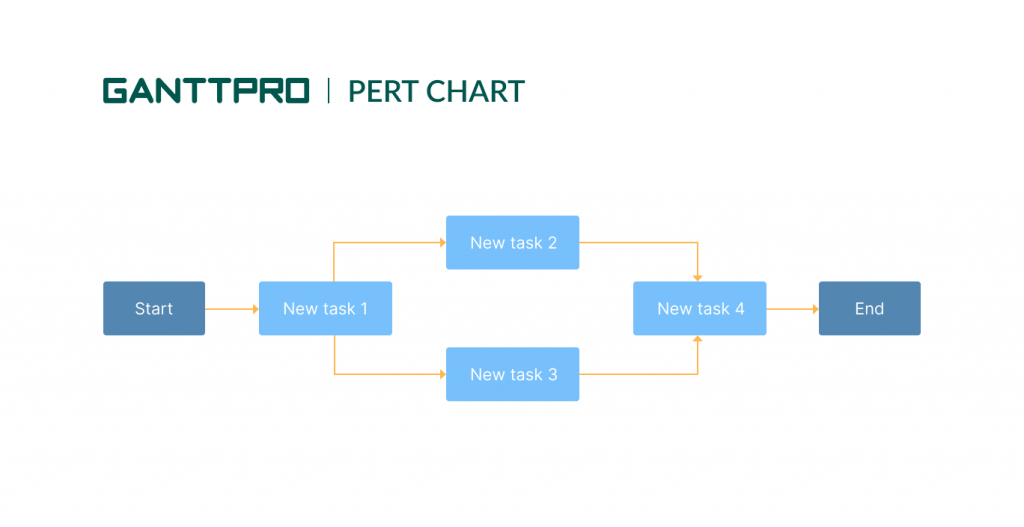
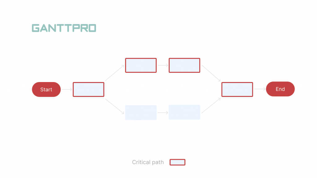
A simple PERT chart
This template demonstrates a simple activity on the arrow chart design. All arrows are labeled with the appropriate tasks and their expected time requirements. The critical path is also clearly labeled.
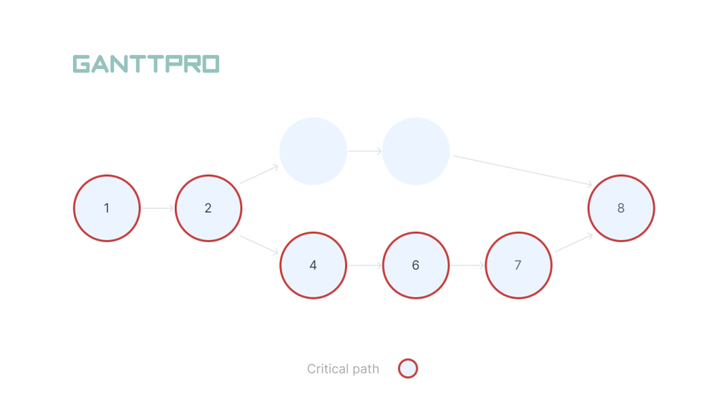
A network PERT chart
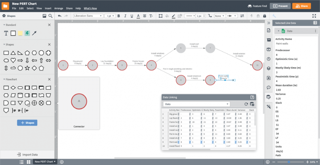
Look at this example of a PERT chart below. It contains task nodes that are laid out in a network diagram. All the nodes include detailed data about the task, time estimations, durations, and start/finish points.
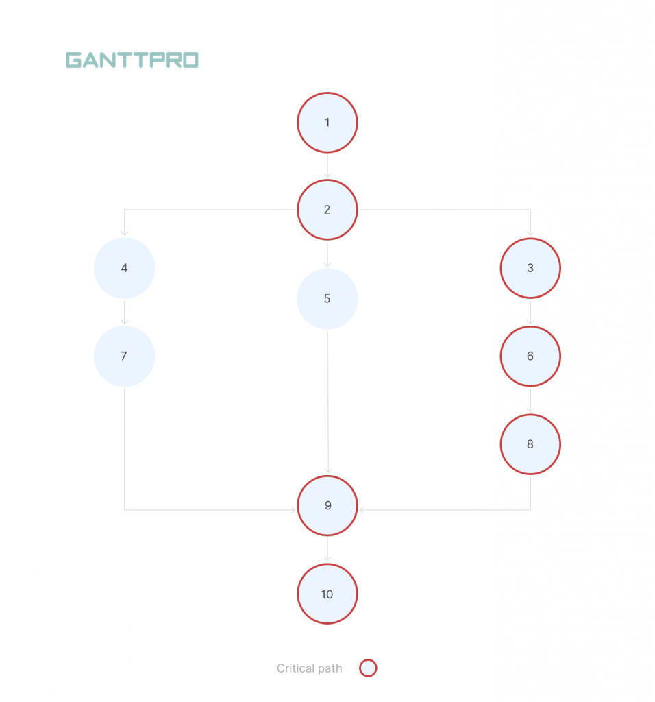
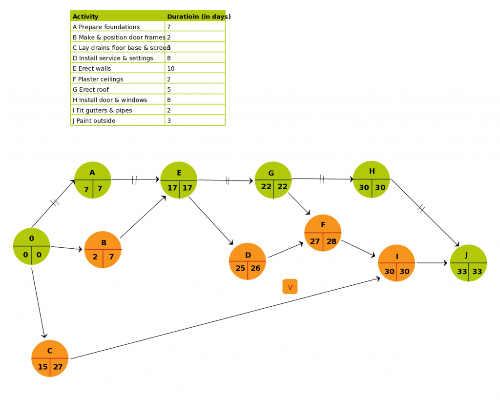
A vertical PERT chart
This simple PERT example has a vertical layout. Circular nodes depict task order, and the critical path is colored in red.
With all these examples in mind, let’s move on to a tutorial showing how to make a PERT chart.
How to create a PERT chart
Any sample PERT chart contains a horizontal timeline with appropriate units (days or weeks). Another type of diagram shows time as a number above the arrow.
What are the steps to create a PERT chart online?
To build it, you should follow these six points.
1. Choose a PERT chart
The first step in the development of a PERT chart is selecting which specific PERT system you want to use and picking up an appropriate software solution.
2. Define your project activities
What you have to do next is to identify all of the major phases, tasks, and milestones in project management activities.
3. Add dependencies
If you have tasks or activities with dependencies, you can easily depict them with directional arrows. This will ensure your team understands the sequence they need to tackle each task.
4. Draw a PERT chart
Now it’s time to take all events and milestones you’ve identified and visualize them as numbered nodes. Highlight all the activities your team members must complete between each node. Directional or divergent arrows will assist.
5. Add timelines for your activities
The next step relates to setting a timeframe as your team members will need to complete all the activities along with all arrows. You can use the estimated time frames or deadlines you set for each activity.
6. Update your diagram
Don’t forget to update the chart as the project progresses.
Advantages and disadvantages of a PERT chart
The benefits of using this tool are evident. However, managers should also pay attention to some drawbacks that can be an obstacle for the project realization.
What are the advantages of a PERT chart?
Here’s the list of the most essential pros a PERT system provides:
- Project teams apply the chart to evaluate time and resources required for their projects.
- They can track and manage all the assets needed during any phase of production.
- The analysis of this diagram includes the information from various departments. It boosts communication during the project course, encourages responsibility, and determines responsible parties across the entire company.
- The Program Evaluation Review Technique helps project managers to perform “What if” analysis. It identifies possibilities and uncertain points related to tasks and events, helping to minimize surprises and waste. This analysis also outlines risks that require careful monitoring during the project.
What are the disadvantages of a PERT chart?
Now consider the cons of the chart for project management:
- According to the PERT technique, your activities must be arranged in a time sequence. The analysis process is subjective in nature. Therefore the tool can not estimate cost and time accurately.
- The chart requires detailed research and preparation before using it.
- It can be expensive to support because of the labor-intensive nature of the method.
From the theoretical part, let’s move on to the practical tools that offer PERT chart functionality.
PERT chart makers
A PERT diagram maker is used to help project managers better estimate the realistic duration of their projects.
The best PERT chart software solutions allow for creating PERT diagrams that are dynamic and easily updated, unlike ready-made templates.
Available PERT chart software for Mac or Windows can be a part of a larger PM tool that takes this diagram and imports it into a Gantt chart online software.
Must-have features of a PERT chart maker
You can apply any PERT chart generator online, invest in project management software, or get all in one advanced tool that has these essential features.
Paid and free PERT chart makers usually provide the following features:
- A Gantt chart to organize and schedule tasks. By combining this chart and a PERT diagram, you can add more details to your project (dates, milestones, assigned resources, etc.), and make it more efficient than it previously was. However, to work with the bar diagram, you first need to know how to read a Gantt chart.
- Dependencies to link tasks and avoid possible bottlenecks. The best PERT chart creator should provide a drag and drop feature for task dependencies without making it a hassle.
- Schedules to plan project timelines. An ideal PERT chart online creator allows you to create a timeline with accuracy to streamline your project to a great extent.
- Critical path to automate calculation. This is a piece of cake with a good PERT chart generator that offers that functionality. Otherwise, it will take a lot of time, effort, and skills on your part.
- Dashboard to see project management metrics in real time. Being able to view the diagram anytime is your priority. A robust PERT chart creator online will do that for you, proposing not only one particular view but multiple.
- Reports to make data-driven decisions. A reliable tool helps to get regular updates, statistics, and performance reports. Whenever you want.
Let’s study some robust online PERT chart generators (free or paid) that you may use right away.
1. Lucidchart
Free option: available.
Individual: starts at €9 user/month.
Team: starts at €10 user/month.
Lucidchart is a free tool to create and explain a PERT chart online. It can help you to build a professional PERT diagram, a Gantt chart, a flowchart, a relational diagram, engineering drawings, and many more.
To prepare a simple PERT here, you need to apply the Rectangle Shape (node) along with connecting links and vectors. After connecting the shapes, you have to specify the names of nodes and process nodes to finish the chart.
It also comes with multiple PERT templates. However, none of these templates can be used for free.
As it is a web-based solution, its users won’t have to be dependent on any third-party upgrades. The tool will automatically upgrade itself with new web-forms.
2. Creately
Free option: available.
Personal: 5 month.
Team: $5 user/month.
Business: $89 month.
Creately is another free diagramming tool that is widely used for making flowcharts, industrial diagrams, organizational and mind maps, engineering diagrams, and more. Creating a PERT diagram is also available here.
You get the friendly PERT chart templates that can be edited according to your requirements. However, you can also generate such a diagram from scratch using Shapes and Connecting lines.
This PERT chart software online provides a handy interface with drag-and-drop functionality and one-click diagramming. Smart shapes, text to shapes, and connectors are available.
You can utilize Creately for free with limited features and functionalities. The tool will also greatly assist in case you need to prepare a good presentation and care about how to present a project in a more efficient way.
3. EdrawMax
Pricing: starts at $99 (billed annually).
EdrawMax is also a popular diagramming platform applied in various sectors. It offers friendly org charts, flowcharts, PERT diagrams, marketing plans, complex industrial and engineering drawings, etc.
This cross-platform software solution runs on Windows, macOS, and Linux. It provides user-friendly templates for almost all types of diagrams and charts.
Choosing the best PERT chart templates
In addition to the templates provided by the tools mentioned above (Lucidchart PERT template, Creately PERT template, and EdrawMax PERT template), you can also find many interesting ready-made solutions among the popular planning software.
Here’s the short list of some reliable options:
- SmartDraw PERT tempate.
- Visme PERT template.
- Coda PERT template.
- OfficeTimeline PERT timeline.
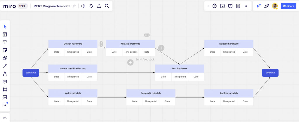
- Miro PERT template.
Explore how the PERT diagram template looks like in Miro.
Have you heard anything about comparing a Gantt chart vs. PERT system? Now it’s time to cover this point as well.
PERT chart vs. Gantt chart
Project managers all over the world frequently rely on PERT charts and Gantt charts when seeking the best organizational options for assigning tasks and keeping track of all their project activities.
The systems are not directly competitive, however, in the project management environment, you can often hear arguments about “Gantt chart vs. PERT chart”.
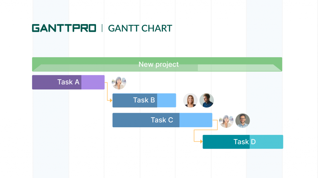
A Gantt chart is typically used for tracking the status of tasks and highlighting scheduling constraints.
Project managers also apply it to break down tasks into smaller activities. That’s why the chart is often included into the feature set of a typical work breakdown structure creator.
Here are some key characteristics of a Gantt chart:
- It consists of a timeline and bars.
- The X-axis shows the timeline, while the Y-axis displays the tasks.
- Tasks appear in a linear fashion on a bar chart.
- The layout demonstrates the expected duration of each task and the entire project.
- It can be used for coordinating resources and scheduling team members.
Both PERT vs. Gantt chart systems are incredibly helpful tools when it comes to project planning and visualization.
Advanced project management with a Gantt chart
Plan and manage projects effectively. All in one place.
Sign up for freeChoosing the right solution within the pair Gantt vs PERT chart for your project will depend on how it may change as time progresses.
- A PERT diagram serves as a reliable tool when mapping out a project. By using numbers, arrows and task dependencies users can define where any potential bottlenecks may occur. The diagram can be a vital resource for planning and visualizing when teams are in the beginning stages of project creation.
- A Gantt chart is best used once your project is underway, especially if there is the possibility of multiple changes as the timeline progresses. Handy bars and lists make it very flexible in terms of illustrating task durations, interdependencies, and resource management.
What is the difference between a Gantt chart and a PERT chart? Let’s figure it out.
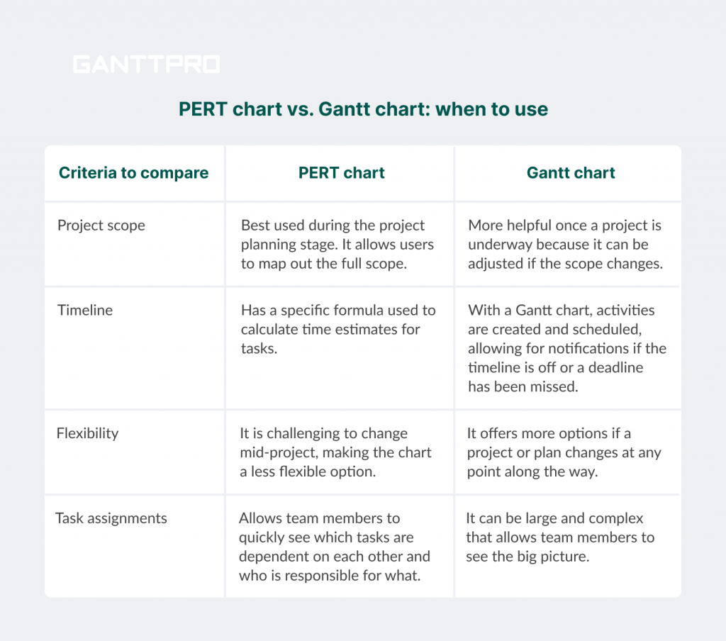
Based on these characteristics, some users clearly see the advantages of Gantt chart over PERT chart, while others don’t.
It’s up to you what to choose. However, with any choice, your arsenal of project management tools is bound to be enriched with powerful PERT or Gantt chart systems.
Apply a PERT chart for better project results
A PERT chart can be an effective tool and your reliable everyday helper in task management and project planning. It may be helpful for implementing “What if” scenarios and be useful in planning for possible obstacles.
Finding a PERT chart tool that offers stunning features might be a bit of a stretch for your team. However, don’t worry and try any of the solutions we’ve mentioned above – they are really worth your consideration.
If you can share your experience about how to make Pert сhart, or if you have any questions, feel free to let us know.