How to Make a Gantt Chart in Google Sheets: Ultimate Guide With Visual Examples & Beneficial Alternative
November 4, 2025 / Estimated reading time: 19 minutes

Audio version:
A Gantt chart has become a reliable tool for Google Sheets users, enabling them to plan, organize, and manage project tasks efficiently.
If you wonder how to make a Gantt chart in Google Sheets, this article will serve as a comprehensive guide and a source of professional inspiration.
Below you’ll find two ways of building a Gantt diagram on the base of online spreadsheets along with a smart alternative for creating impressive project diagrams.
The video overview is also available at the end of the article.
Contents:
- How to make a Gantt chart in Google Sheets using a stacked bar chart.
- How to make a Gantt chart in Google Sheets using the timeline feature.
- Choosing a more professional way to build a stunning Gantt chart.
- How to create a Gantt chart in GanttPRO.
How to make a Gantt chart in Google Sheets using a stacked bar chart
Project teams continually search for ways how to build a Gantt chart in Google Sheets. They can do it for free using a stacked bar chart.
Below you’ll see a step-by-step instruction for everyone who wants to know how to make a simple Gantt chart in Google Sheets without extra effort.
- Create a new Google Sheets file.
- Set up columns with data.
- Add the Start on day column.
- Define the duration of tasks.
- Insert a stacked bar chart.
- Improve and format your chart.
- Share your Gantt chart.
1. Create a new Google Sheets file
As a Google Workspace user, you can access a range of settings to generate and customize plain Gantt chart Google Sheets.
If you are not logged into Google, you will be prompted to sign in with your Gmail account and password to proceed.
After that, you can create and open a new Google Sheet.
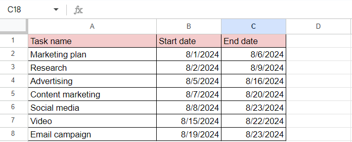
2. Set up columns with data
Before diving into the process of generating a Gantt chart, it’s essential to have a well-structured data set.
First of all, title columns according to your project requirements. Standard titles for a Gantt chart typically include:
- Task names.
- Start and end dates.
Type the corresponding data into the required cells.
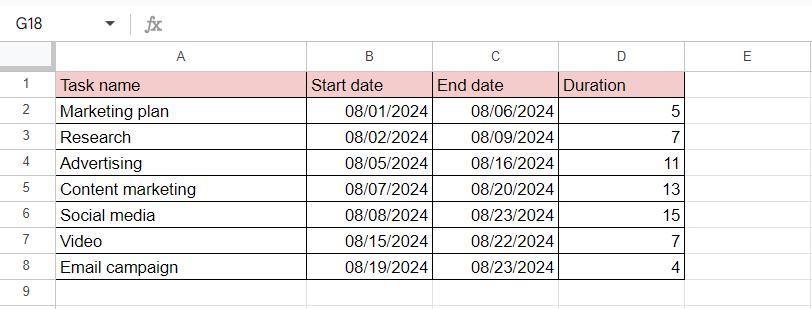
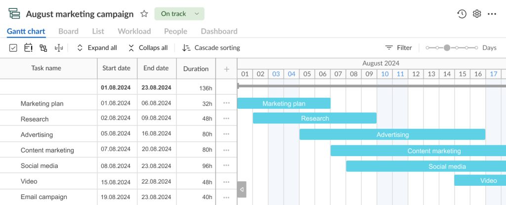
For your convenience, below we consider an example of a marketing campaign project. The implementation period of this project is about a month. The team includes 7 people.
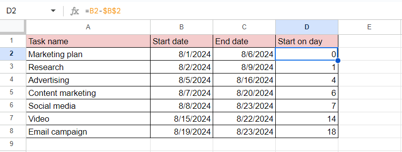
3. Add the Start on day column
Add a new column and title it Start on day. In our example, it’s a column D.
Google Sheets will need it when creating a stacked bar chart (most similar to a Gantt chart).
Enter the formula =B2-$B$2 in the first cell of this column. It’ll be converted to the required value.
Note: we use value B in this formula because our Start date column is B. Accordingly, your column may be different. 2 here means the number of a required line with a task. You may have a different value.
After adding this formula to the first row, Google Sheets will prompt you to autofill the rest of this column.
If not, you can do it manually by applying the formula for each cell of the column (while changing the value 2 to the relevant numbering of each row).
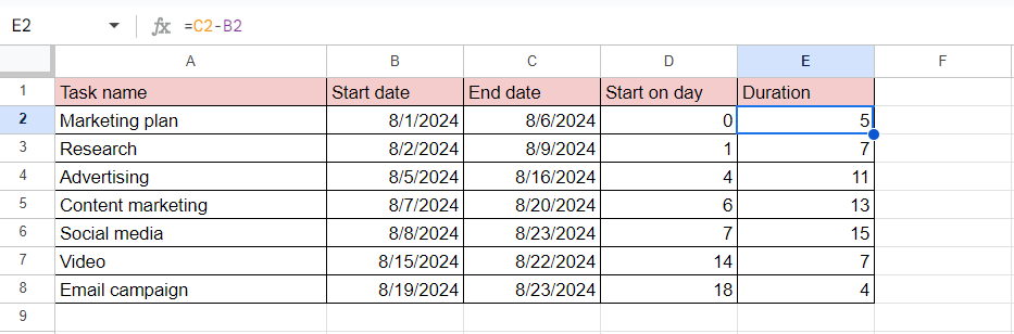
4. Define the duration of tasks
Add a new column to determine the duration of your tasks.
Title this column as Duration and enter the formula =C2-B2. Remember that here C corresponds to our column С (End date).
Google Sheets will also suggest you apply the autofill feature but it’s good to know the manual way as well.
To do it, enter the formula for each cell of the column (while changing the value 2 to the relevant numbering of each row).
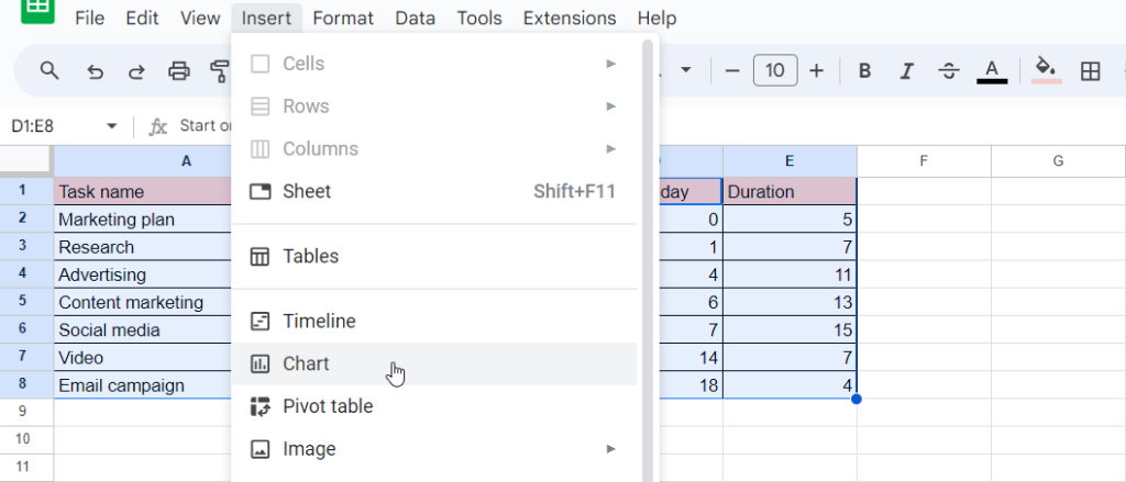
5. Insert a chart
The necessary columns are ready.
Now select all the values in the first column.
Then hold the Control key on your PC keyboard (the Command key if you work on Mac). Pressing on this key, choose all values in the columns Start on day and Duration.
Then find the Insert option at the top of your screen and click Chart in the drop-down.
After completing this step, a chart with a random view will appear on your spreadsheet.
However, to get a Gantt chart view at the end, you need to apply a stacked bar chart.
To find it, click twice on the appeared diagram. You’ll see the Chart editor menu on the right side of your screen.
Select Stacked bar chart in the Setup section.
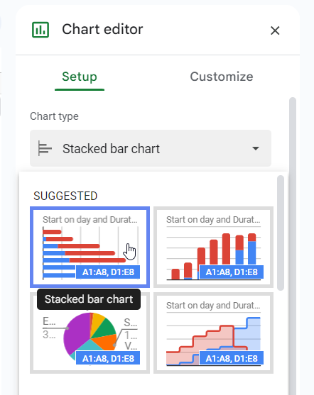
This is the right type of chart needed for generating a Google Sheets Gantt diagram.
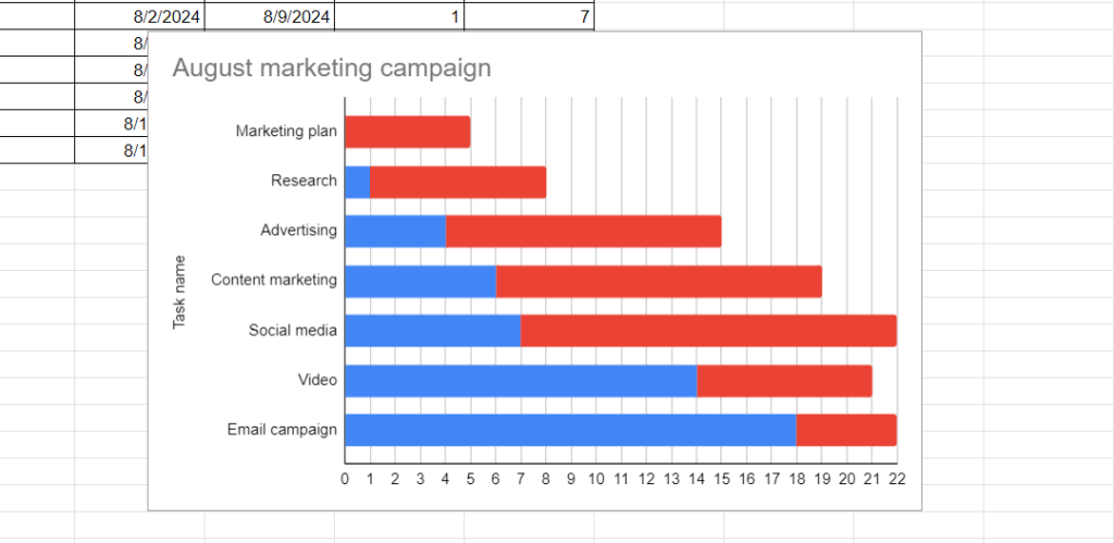
Your chart now should look like the image below.
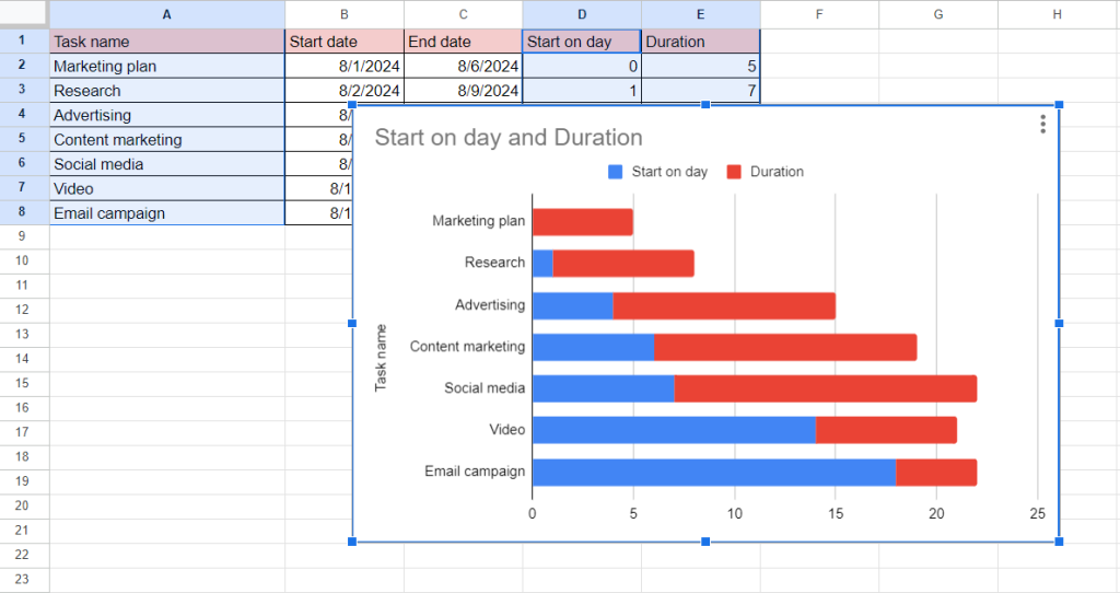
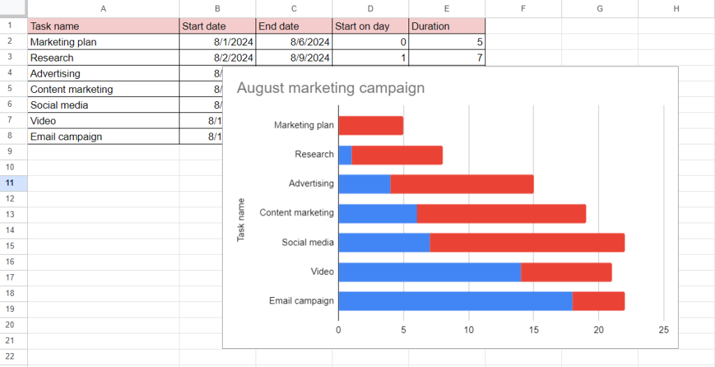
6. Improve and format your chart
You can rename or delete the chart title and legend.
In our example, we decide to remove the legend and name our chart as “August marketing campaign.”
If you want to do the same, click twice on the title or legend fields and then rename them or press the Delete key on your keyboard once they are selected.
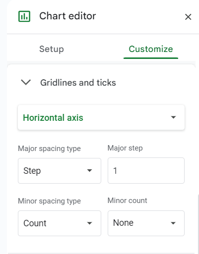
Now you can format the horizontal axis values.
Click twice on your chart and find the Customize section in the Chart editor menu on the right side of your screen. Select Gridlines and ticks.
These values measure your timeline in days. However, you can set your own scale that will work for your project.
In our example, we choose Step as the major spacing type and an interval of 1 day for the horizontal axis.
Our diagram is gradually acquiring the desired appearance.
However, a few more important steps will allow for achieving better results.
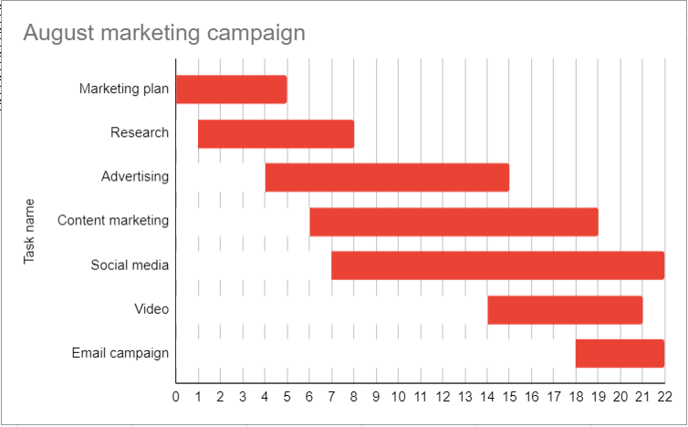
It’s time to hide the blue bars.
Click twice on them.
Once they’re all selected, you’ll get the Series section on the Chart editor menu on your right.
Click on Fill color and select the white theme color.
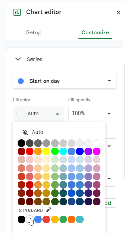
It’ll help you hide blue bars to make the stacked bar chart look like a Gantt chart.
Now, it’s possible to change the color of each red bar of the chart to better distinguish tasks.
If you need this option, click twice on the first red bar. This will select all your bars.
Then click again on any bar to choose it and define a unique fill color.
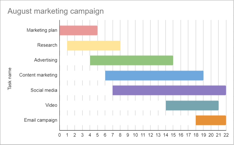
Your free online Google Sheets Gantt chart is ready.
7. Share your Gantt chart
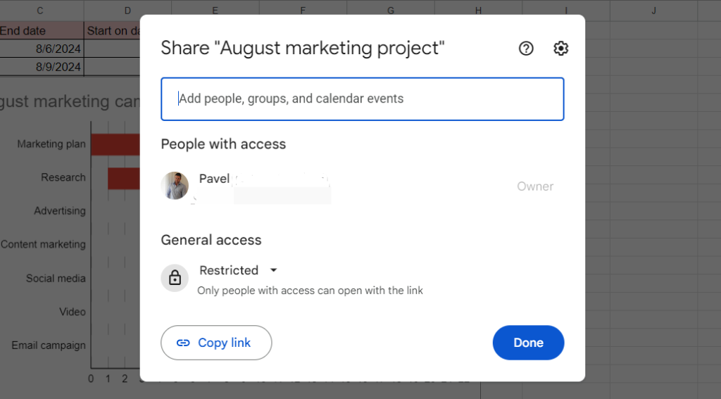
It’s crucial to adjust the access permissions to ensure your team members can access your Gantt diagram.
The next actions will assist.
Click on the Share button that is located in the very top right corner of your screen.
In the appeared box, you can specify people with whom you can share your project or copy the link to transfer your diagram to someone later.
You can also adjust the General access section here.
The described step-by-step method looks simple and accessible like some other available Gantt chart guidelines for building such a diagram in other popular tools.
For instance, the following tutorials will assist if you want to know:
- How to make a Gantt chart in Excel.
- How to make a Gantt chart in MS Project.
- How to make a Gantt chart in PowerPoint.
- How to make a Gantt chart in Word, and in other tools.
However, there is one more advanced method to build such a diagram for those users of Google Sheets who work with paid plans, including Essentials, Business Starter, Business Standard, Business Plus, Enterprise plans, Education plans, and Frontline.
Let’s explore this quicker way of making a Google Sheets Gantt chart using the timeline feature.
How to make a Gantt chart in Google Sheets using the timeline feature
Google Sheets introduced its new timeline feature that facilitates the creation of more interactive and attractive Gantt charts in 2022. It allows for building a neat diagram and using new options to format it.
Let’s figure these options out.
- Create a new Google Sheets file and set up columns with data.
- Insert a Gantt chart into your Google Sheet.
- Implement available Gantt chart settings.
- Share your Gantt chart.
1. Create a new Google Sheets file and set up columns with data
This step looks the same as the initial step in the previous tutorial.
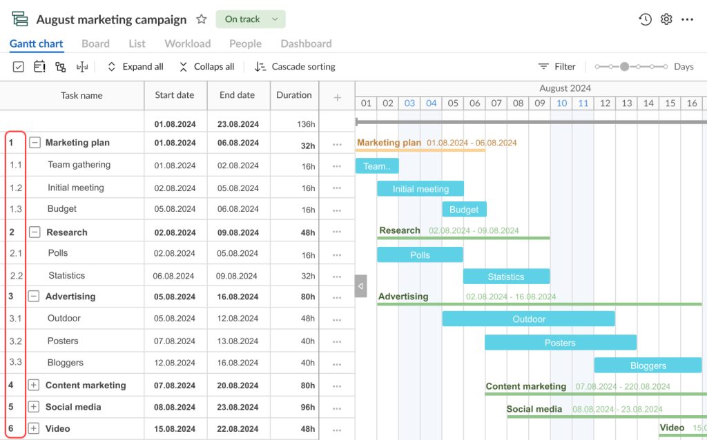
In short, you need to create a Google Sheet file and fill it with the necessary info, including task names and start and end dates. In this case, you need to add a column with task durations. The Start on day column may not be used.
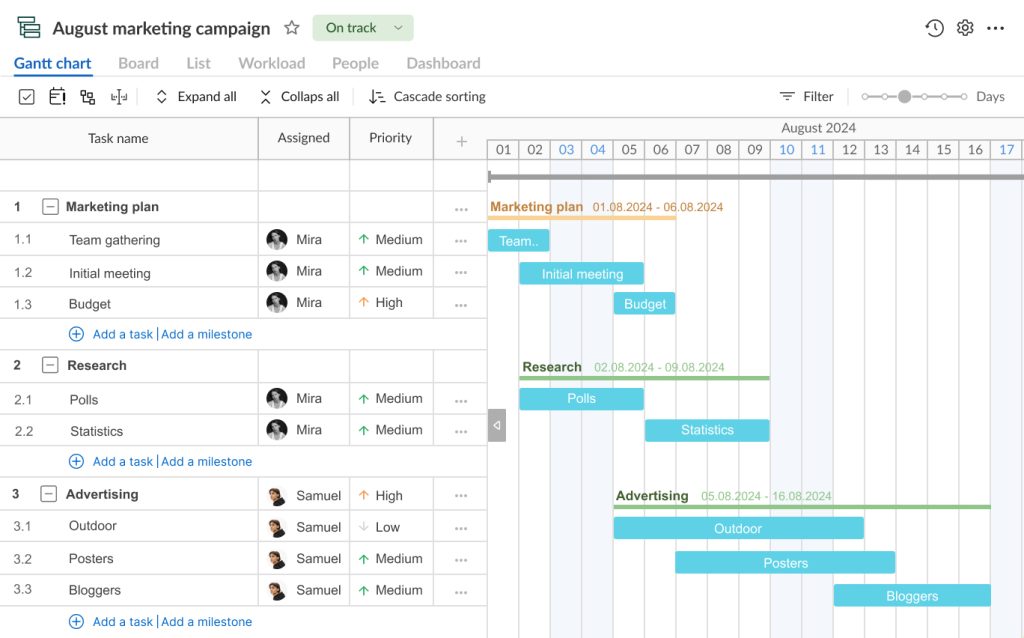
You can also add extra columns like assignees, priority, and status, or make these additions later.
In our example, we add a column with assignees.
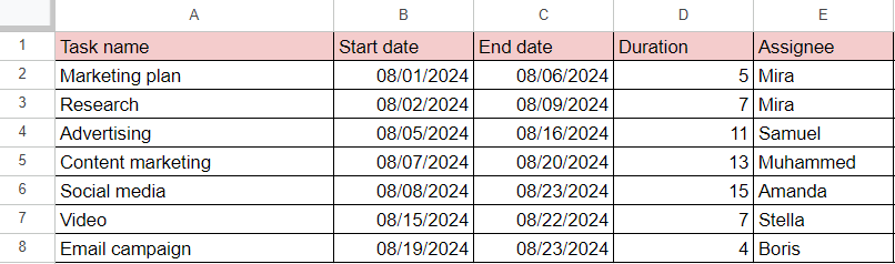
Now a table with initial project data looks ready. It should be enough to get a simple and neat Google Sheets Gantt chart.
2. Insert a Gantt chart into your Google Sheet
With this project data neatly organized in columns, you can insert a timeline – it will form the basis of your Gantt diagram.
Note: it’s better to highlight your entire data set (all filled columns) to have more options to work with settings later.
Anyway, the tasks with start and end dates columns are the minimum required columns to create such a timeline.
Go to the menu bar at the top of your Google Sheets page and pick up Insert. The drop-down menu will appear, and you’ll be able to select Timeline.
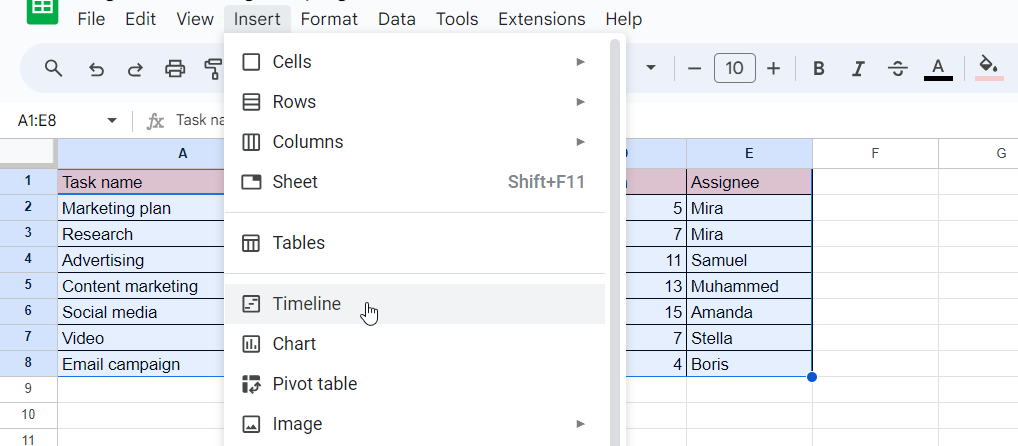
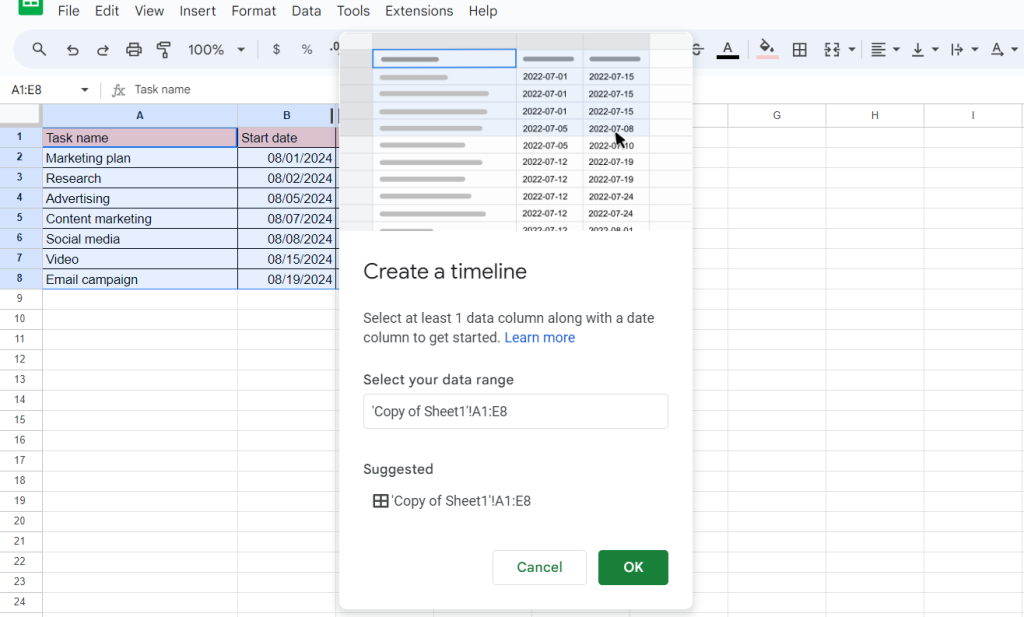
A single click on Timeline will open a pop-up window where you can enter or select a range of data if you didn’t choose it at the beginning.
When it is done, click OK.
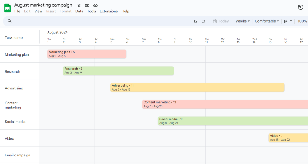
Despite being called Insert, this menu option will create a new tab in your spreadsheet, converting the selected data into a horizontal Gantt chart.
This chart reflects all your project tasks neatly arranged in a new format.
This is already a basis for a full-fledged Gantt chart.
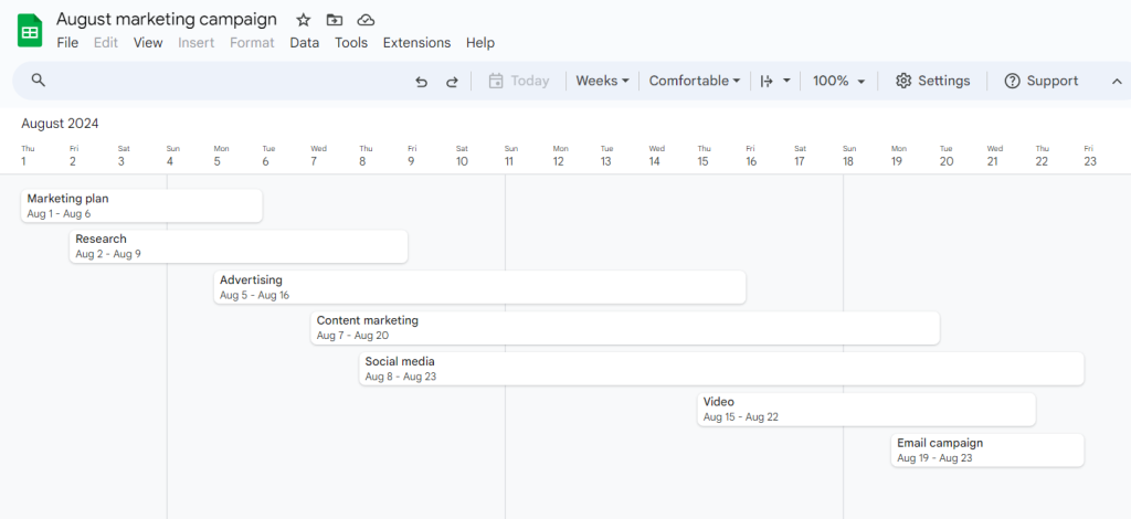
Please note that Google Sheets will automatically add new tasks to your Gantt chart when you include them.
3. Check and implement available Gantt chart settings
When your online diagram is created, it’s time to fine-tune the details and explore additional settings. By applying these settings effectively, you can customize your Gantt chart in Google Sheets to best fit your project requirements.
Now set the data range.
If you added new columns or tasks that weren’t automatically included in the chart, you can easily redefine the data range.
In the top pane of your chart editor, you will find the Settings menu.
By clicking on it, you will get an expanded editor sidebar and see the Select data range option in the Required fields section.
Adjust it as needed.
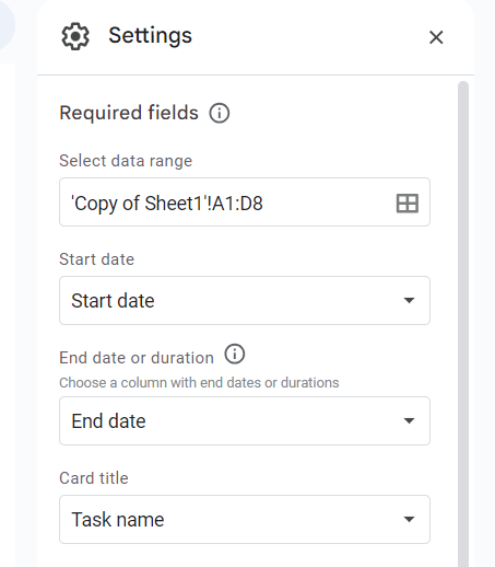
Remember that if a table row of data misses a title or date, it won’t be visible as a bar on your timeline.
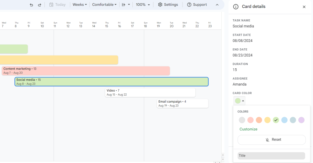
You can adjust task bars (they are called cards in a Google timeline).
They may contain different data, including task name, start date, duration, assignees, or any other information added to your table columns.
In our example, we choose the columns that best describe each task: task names, start and end dates, and duration.
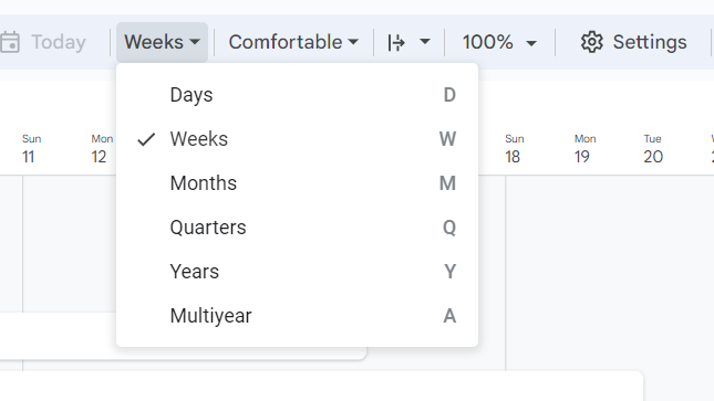
It’s also possible to change the view of your timeline.
You can find the corresponding menu with the default value Weeks on the top pane above your timeline. By clicking on it, you’ll get a drop-down list.
Choose days, weeks, months, quarters, or years.
You can specify the color and other details of task bars to add a visual dimension to your chart.
Click on any task on your Gantt chart and you’ll see the Card details menu on the right pane.
You’ll be able to change the color of this task by choosing it from the color options. The background color will be changed, while the font color will stay black to retain legibility.
Additionally, Google Sheets allows for grouping tasks based on the data reflected in a certain column.
For example, you may group tasks by their names, assignees, status, priority, etc. This action allows you to always see the necessary data to the left of your timeline.
Let’s group tasks by their names.
To do it, go to the Settings menu again and find the Optional fields. You’ll see the Card group section where you can apply Choose group by column and select the desired option.
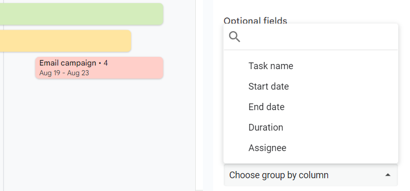
Now you can see a list of tasks grouped on the very left side of your diagram.
The next step will allow your colleagues or other stakeholders to see it.
4. Share your Gantt chart
This step completely coincides with the similar step you did when sharing a Gantt chart using a stacked bar chart in Google Sheets.
Find and click the Share button in the top right corner of your screen.
Then choose the people with whom you want to share your chart or copy the link to transfer it to someone later.
This step has concluded our quick tutorial on how to do a Gantt chart in Google Sheets.
Let’s briefly summarize the main things. You’ve got a Gantt chart with relation to time, rather than a spreadsheet with row numbers. Your colored tasks are organized from left to right based on the first date in your project selection.
Not bad, right?
However, do both views of this diagram look complete and functional? Or does it make sense to consider another option?
Choosing a more professional way to build a stunning Gantt chart
Why is a Gantt chart so popular?
The secret lies in its powerful planning capabilities and user-friendly visualization.
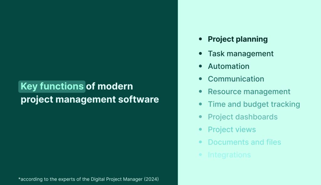
No wonder project planning (including Gantt chart scheduling) is called one of the most important functions of modern project management software.
At the same time, many teams and individuals want their online tools for visualizing project tasks to be more advanced and professional.
What if such a diagram not only shows tasks, their dates, durations, and some other details but also displays task dependencies, highlights milestones, sets deadlines, considers resources, and much more?
Fortunately, if you want to get appropriate Google Sheets alternatives with the advanced Gantt chart creation functionality, you don’t have to look far.
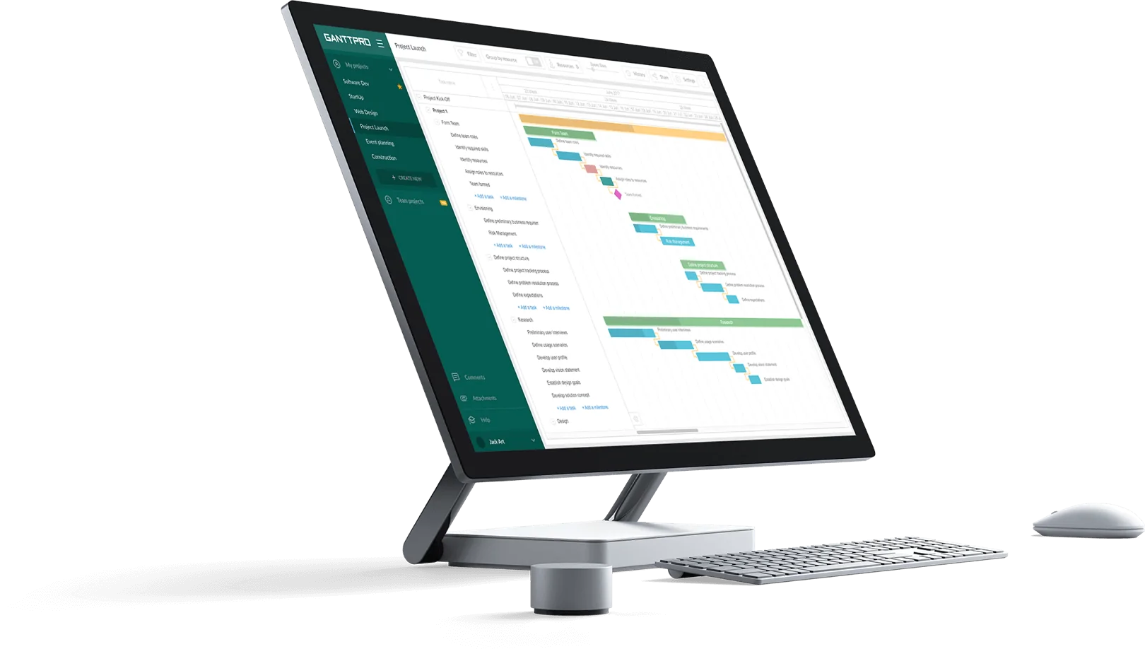
GanttPRO is a powerful project management solution for building Gantt diagrams that can lead any project to win in a short time.
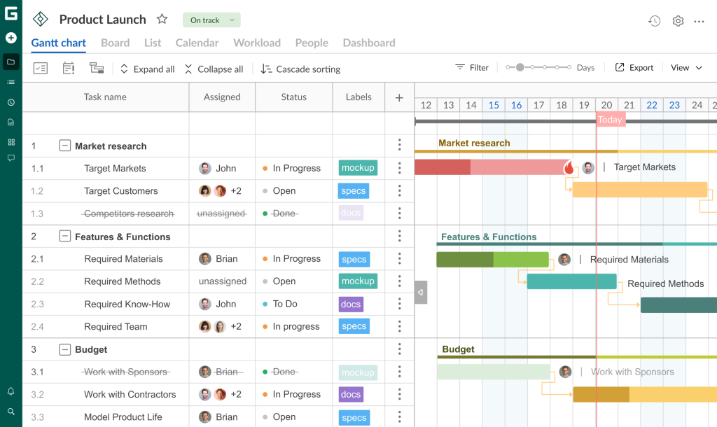
The power-packed Gantt chart software has earned recognition in the project management community all over the world. It facilitates the creation of interactive diagrams, enabling advanced task planning and resource allocation.
Project teams benefit from comprehensive visualization that streamlines the scheduling, organization, assignment, and monitoring of tasks and resources. Additionally, teams use GanttPRO to track project progress, manage work shifts, enhance deadline adherence, improve both internal and external communication, and more.
Here is what Adam Hirsk, the head of product and R&D at Pacvac, a manufacturer of backpack vacuum cleaners (Australia) thinks about the tool:

We tried top recommended 5-6 Gantt chart planners and GanttPRO was the one that seemed the most intuitive with good UI, which is the main reason I selected it. I also liked the custom columns feature, this actually makes a big difference when compared to other solutions.
Let’s now discover the impressive features of this trustworthy software and describe how to make a Gantt chart in GanttPRO in minutes.
How to create a Gantt chart in GanttPRO
Before you start generating a Gantt chart in GanttPRO, let us remind you of several formal yet important actions:
- If you’re not a GanttPRO user, take a few seconds to register. To do this, enter your email address or register with Google, Microsoft, Facebook, or LinkedIn.
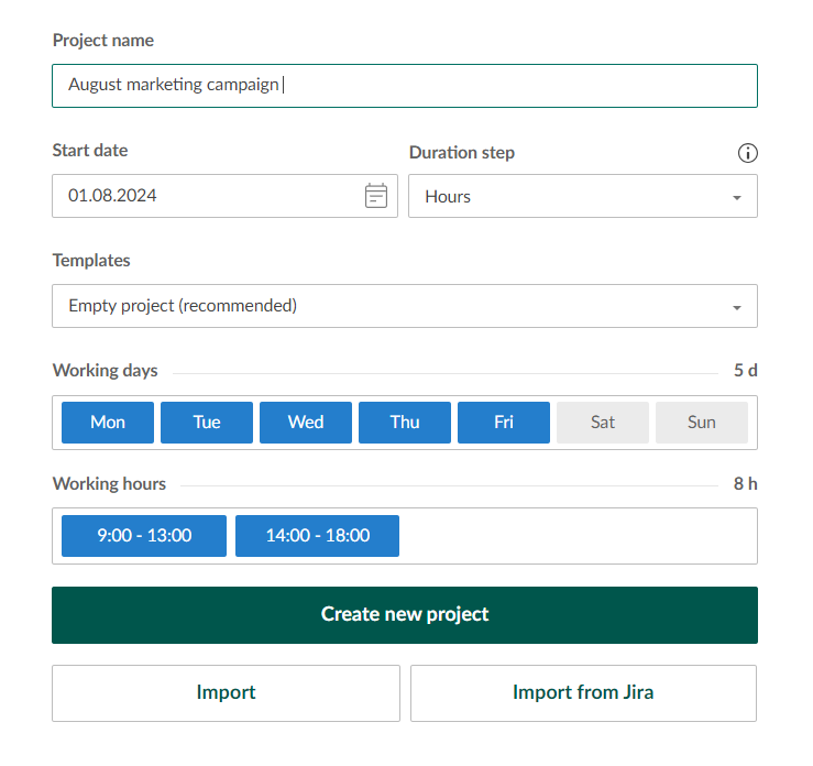
- If you’ve already appreciated the wide capabilities of GanttPRO up to this point, then simply log in and click the Create a new project button – you will find it in the upper left corner of your page. Then enter the required data in all settings that appear in the window.
Now everything is ready for creating a stunning Gantt diagram.
- Open a project and list tasks.
- Break down tasks and set a hierarchy.
- Visualize project resources & track workload.
- Link dependent tasks and add key project milestones.
- Check out even more useful project management features.
1. Open a project and list tasks
First of all, list your project tasks.
Don’t forget to specify the start and end dates for each task as well as their duration (as you did in Google Sheets).
Adding this data in GanttPRO is as easy as child play.
You can see a plus sign (+) at the top of the project grid.
By clicking on it, you’ll get a new window with the list of fields that can be added to your project.
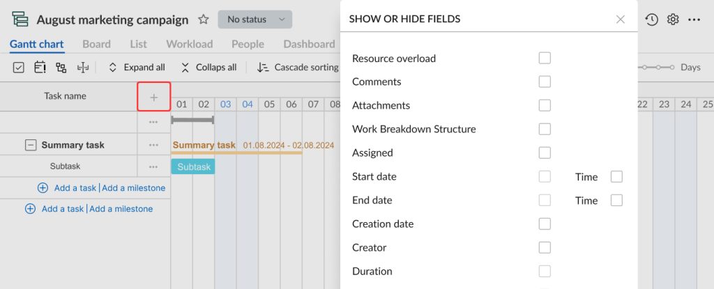
The chosen fields with the required data will be located to the right of your tasks.
Below is what you should get.
You may also visualize such fields as assignees, status, priority, estimation, comments, etc. The option of adding your own fields is also available.
You can simplify the task of creating a GanttPRO diagram by implementing ready-made Gantt chart templates. They have been specifically designed for a variety of projects and spheres from IT and marketing to manufacturing and construction.
2. Break down tasks and set hierarchy
A simple and user-friendly work breakdown structure (WBS) is what distinguishes GanttPRO from Google Sheets. This feature allows for systemizing tasks and defining logic inside a project.
With this WBS, you can determine and visualize subtasks, making project activities clear for everyone in your team.
3. Visualize project resources & track workload
GanttPRO allows for planning and allocating all the assets of your project including labor, materials, finances, vehicles, equipment, and so on.
To reflect resources on your GanttPRO project, you need to assign them to the necessary tasks.
It’s possible to manage people and virtual resources. You can also define their costs, set personal calendars for them, and specify their roles.
Workload management is also a beneficial feature that the software comes with.
With its help, you can control the load of your team at any time. In case you notice an overloaded assignee, you’ll see the red human icon near them.
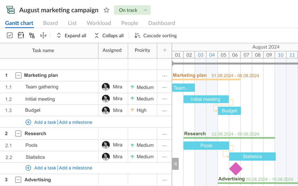
4. Link dependent tasks and add key project milestones
When the required project resources are visualized, it’s high time to determine task dependencies.
In GanttPRO, you can do it in minutes by applying handy drag-and-drop or using task settings.
Your dependent tasks will be linked with small arrows. These project activities can be connected in different ways, taking into account their start and end dates.
Additionally, you can highlight key activities on a timeline that are called project milestones. They will help you never lose crucial work processes and events.
5. Check out even more useful project management features
Your Gantt chart may look even more professional and advantageous.
Luckily, GanttPRO has everything to assist you, including the capabilities to:
- Track progress.
- Plan and manage project finances.
- Control risks.
- Manage deadlines.
- Track time.
- Apply advanced reports.
- Use collaboration means.
- Implement ready-made templates and more.
GanttPRO also allows for sharing a Gantt chart even with anyone outside your team: stakeholders, customers, partners, etc. A shared link gives access to any person who gets it to view your project together with the details that you want to share.
All these features and extensive capabilities of the Gantt chart maker help to enhance project results and foster success in a competitive project management landscape.
Now you know how to create a Gantt chart in Google Sheets or make it using a modern PM software solution.
Online Gantt chart software
Organize and manage projects with a powerful Gantt chart.
Sign up for freeTake the most out of a handy Google Sheets Gantt chart or choose a more powerful diagram
Although Google Sheets offers several ways to create a Gantt-like chart for free or within some of its paid plans, generating a feature-rich and attractive Gantt diagram is still a complex task there.
Anyway, if you decide to build such a diagram using a simple stacked bar chart, consider some crucial steps, including:
- Creating a new Google Sheets file.
- Setting up columns with data.
- Adding the Start on day column.
- Defining the duration of tasks.
- Inserting a stacked bar chart.
- Formatting a chart.
- Sharing your Gantt chart.
In case you have the option to apply the paid Google Sheets timeline feature, feel free to build a Gantt chart with the following steps:
- Creating a new Google Sheets file and setting up columns with data.
- Inserting a Gantt chart into a Google Sheet.
- Implementing available Gantt chart settings.
- Sharing a Gantt chart.
Finally, if you seek a more convenient and straightforward way to visualize your project tasks on a professional Gantt chart, consider GanttPRO. You’ll be able to set deadlines, mark key milestones, visualize dependent tasks, track their progress, count all the involved assets, and much more.
This video highlights all important points.
Frequently asked questions about how to make a Gantt chart in Google Sheets
-
Yes, you can do a Gantt chart in Google Sheets, although it doesn’t offer a built-in Gantt chart feature. It’s possible to use a combination of a stacked bar chart and some creative formatting to generate such a diagram. The users of some paid Google Workspace editions may create an advanced Gantt chart using the timeline feature. Additionally, there are online templates that can simplify the process.
-
Google provides free Gantt chart capabilities through Google Sheets. You can create such a diagram by using a stacked bar chart and formulas within the spreadsheet or apply the timeline feature that is available within some paid Google Workspace plans. You can also apply helpful templates available in Google Sheets for this purpose.
-
Google Sheets doesn’t come with project management features like dedicated software. However, it can be customized for project management needs. Users can create Gantt charts, task lists, and timelines using templates or manual setups. Integration with Google Calendar and Google Drive can enhance its functionality for managing projects.
-
Google does not have a standalone Gantt chart app. However, you can create simple Gantt charts using Google Sheets or available add-ons. These tools allow you to manage projects and timelines within the Google ecosystem.
-
To turn a spreadsheet into a Gantt chart, organize your data with tasks, start dates, end dates, and durations. Use a spreadsheet program like Excel or Google Sheets to create a stacked bar chart or apply a timeline feature that is available within some paid Google Workspace plans. Adjust formatting and use additional settings to make your Gantt diagram clear and visually appealing.
-
Yes, Google Sheets offers a Gantt chart template. You can find it by going to Google Sheets, clicking on the Template Gallery, and selecting the Gantt Chart template under the Project management category. This template includes predefined columns and formatting to help you plan and track project timelines effectively.
Read also
Join 1M+ project managers!
Create Gantt charts in minutes with GanttPRO and reduce time spent on managing tasks by 40%
Try for freeNo credit cards required. No obligation.