How to Make a Gantt Chart in Excel: Step-by-Step Tutorial [Alternative Included]
November 5, 2025 / Estimated reading time: 16 minutes

Audio version:
Thousands of people use Microsoft Excel every day for office or personal needs. However, many users mistakenly believe that Excel is only for creating tables, not realizing its capacity to perform numerous operations. For instance, many project teams are unaware of how to make a Gantt chart in Excel.
In this guide, we describe detailed steps to create a powerful Gantt diagram using familiar spreadsheets, as well as a more efficient way to do it with multi-purpose project management software.
Contents:
- What is a Gantt chart in Excel?
- How to make a Gantt chart in Excel.
- From familiar Excel to a more powerful tool.
- How to create a Gantt chart in GanttPRO.
What is a Gantt chart in Excel?
You hardly meet someone who has never heard about Microsoft Excel. But what is a Gantt chart?
A Gantt chart is a horizontal bar chart that visually represents a project with the help of two axes – a vertical one that is used to present tasks and a horizontal one that defines start and end dates.
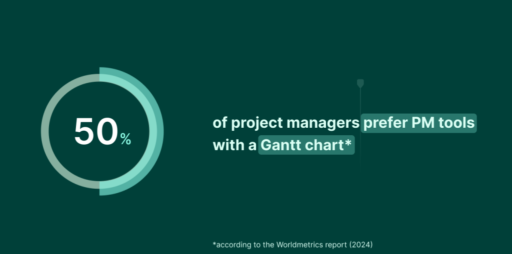
By the way, the author of the Worldmetrics report (2024) asserts that 50% of project managers prefer PM tools with a Gantt chart.
Anyone who uses a Gantt chart to manage projects has activities and time frames clearly visualized. This principle is applied in any planning software, including Excel. Therefore, a Gantt chart in Excel is similar to any other Gantt chart in other tools.
For example, you can create a Gantt chart in MS Project, the popular, yet hard-to-learn tool. Or you can even try unexpected solutions and make a Gantt chart in PowerPoint, familiar Google Sheets, or, surprisingly, in Word.
However, it is much better to use special software and create Gantt charts in GanttPRO, for example.
We’ll come back to this more professional way of generating an online diagram later. For now, let’s dive into the details of the guide that demonstrates how to create a Gantt chart in Excel.
How to make a Gantt chart in Excel
If you want to visualize your project activities on a Gantt diagram created in Excel, you won’t need special technical skills.
This is confirmed by Michael MacInnis, a data engineer at Trade Republic, a savings platform. He’s what he admits:
I greatly appreciate Excel’s built-in charting and graphing feature. These features make basic data visualization actions easier to execute without advanced technical knowledge of this software.
However, you’ll need to take some consistent steps to build a Gantt chart, as the tool doesn’t provide a magic button with which this diagram can be generated in one click.
Below you’ll find these detailed steps. Suitable for both newcomers and experienced professionals, they will deliver all you need to produce a simple Gantt diagram.
Incidentally, you may recognize these steps if you’ve ever explored how to create a project timeline in Excel.
We’ll demonstrate the examples of interfaces from the online version of the tool, as they look relevant and almost coincide with the latest desktop versions.
There are many Excel versions still in use: 2021, 2019, 2016, 2013, and older. They include features available at the time of their release.
Keep in mind that older types of Excel are not so advanced while the latest versions have more powerful functionality, including the features for creating charts.
- Make a table and add tasks.
- Create a Gantt chart using a stacked bar.
- Format the stacked bar chart.
- Change the order of tasks.
- Improve your Excel Gantt chart with additional features.
1. Make a table and add tasks
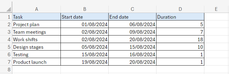
Before making a Gantt chart in Excel, you need to prepare the data this chart will be based on.
Create a spreadsheet and put down all the information necessary for your project.
Start from the leftmost column and add:
- Tasks (or their brief descriptions).
- Start date (when your task begins).
- End date (when your task ends).
- Duration (the total time or days needed to complete a task).
Here is a sample of how it can be visualized in Excel.
Your table with data looks ready. The digital dates format in this table can be easily transformed into the same format in a chart but sometimes errors may arise.
It’s important to understand that the date format may vary depending on your Excel settings (for example, dd/mm/yyyy, dd.mm.yyyy, yyyy/mm/dd, etc.). It may also differ between versions of the tool, and such inconsistencies in format can prevent the creation of a correct chart.
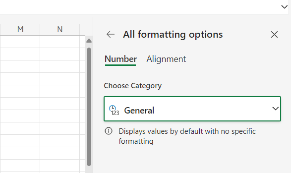
Excel users often make a quick date conversion to a general numeric format to guarantee that they get exactly a stacked bar chart with the right date display.
Highlight all your dates within the Start date column. Then press the shortcut key Ctrl together with 1 on your keyboard to open up the format cell’s pane. You’ll see that it’s currently set to the Date format.
Choose General up on top and then click on Ok.
The date format in this column will change to a general numeric format.
You actually don’t need all the data to insert a Gantt chart. So, highlight your tasks, the Start date, and the Duration.
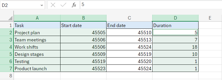
With all of this data selected on the top tabs, you are ready to move on.
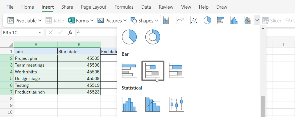
2. Create a Gantt chart using a stacked bar
Now you can start making your Excel Gantt chart by setting it up as a stacked bar chart.
Keep the columns mentioned in the previous step highlighted and choose the Insert tab in the top settings ribbon within the same spreadsheet.
In the Charts section, you’ll see a drop-down with the Bar Chart selection menu.
Choose Stacked Bar – the closest option to a Gantt chart in Excel.
You’ll get the initial view of your chart.
However, it is still far from the desired version.
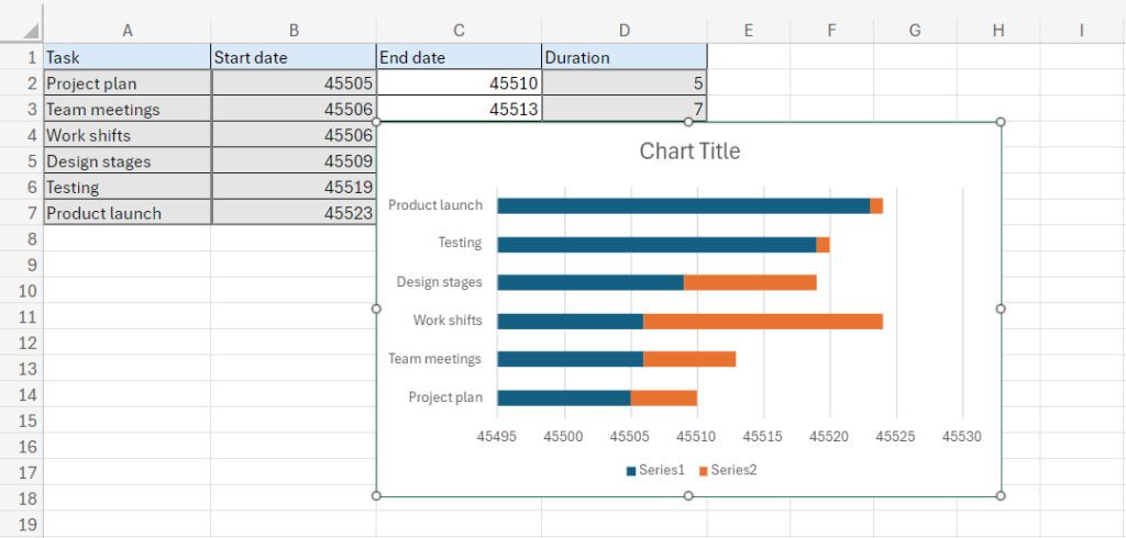
However, don’t worry, though: it only takes a few simple steps to get the look you want.
3. Format the stacked bar chart
You remember that the dates are shown as numbers because we wanted to avoid the transition error and get the correct chart view. Now you can change them back to dates.
Move your newly inserted chart over to the right-hand side and highlight all of these date cells again.
Change this back to a date type in the same way as was done in the previous step (Ctrl + 1). Down below, click on Ok. The required dates will appear on the line below.
Now it should look a little better but it is still not a Gantt chart.
To start formatting your data, you need to click twice on the chart image to open the Format pane.
The pane will appear on the right-hand side of your screen.
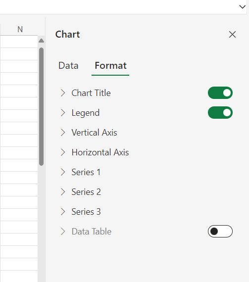
Find the Series 1 section and click on it.
Among other options, you’ll see a paint bucket. Click on it and select No Fill down below.
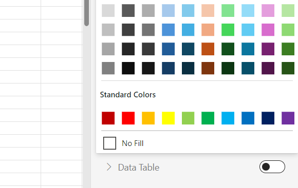
After that, the blue part of the bars will disappear.
Here is what your chart should look like.
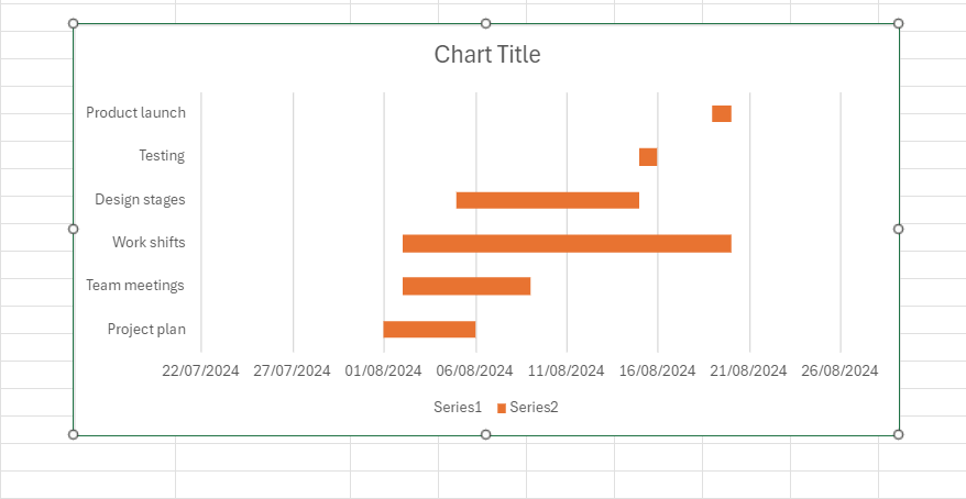
4. Change the order of tasks
You see that your project tasks are not in the right order.
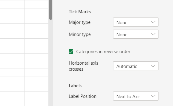
To change this order and align the tasks, you’ll need to open the Format pane again (if you closed it earlier).
Follow the vertical axis options and scroll down to find a checkbox Categories in reverse order.
Check it.
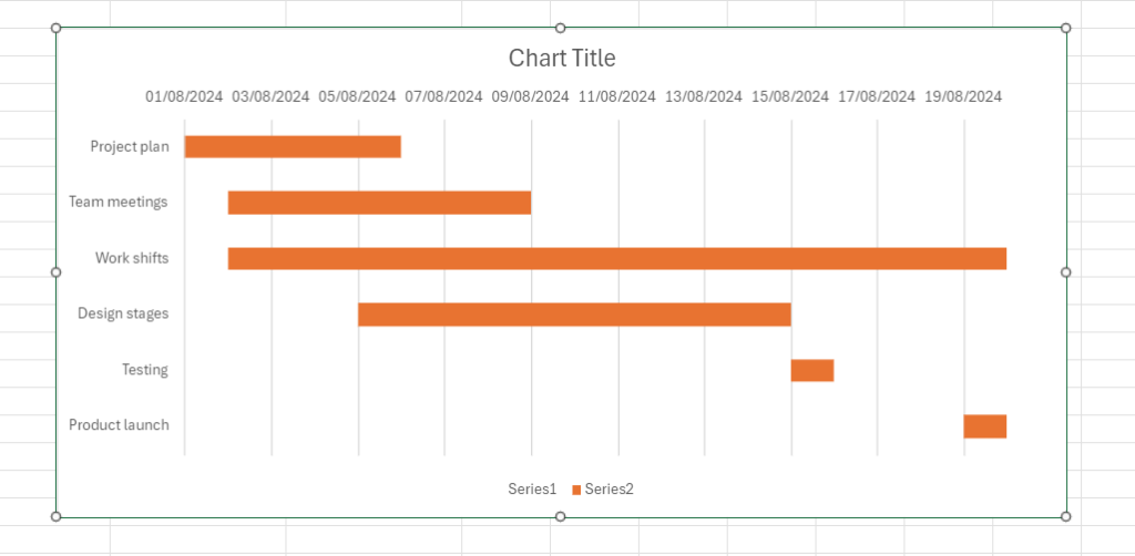
Your tasks are visualized in the correct order now.
It’s up to you to leave the line with the dates below or put it on top of tasks by clicking on the corresponding option in the same part of this pane.
It’s also possible to minimize a large gap before the first task on a line.
Click twice on the dates above your chart. The horizontal axis menu in the Format pane will appear.
Find the Bounds section and put this date instead of the Minimum value. Then do the same for the end date changing the Maximum value.
5. Improve your Excel Gantt chart with additional features
If you don’t need the Legend section of your chart, you can easily remove it.
Select it and then click on Delete using the right mouse button.
It’s also possible to name your new diagram.
Click on the chart title and rename it as you wish.
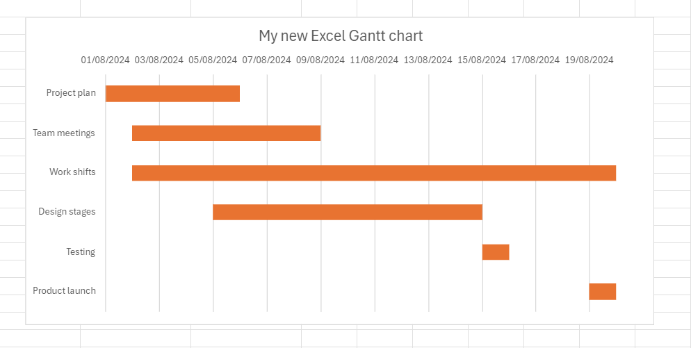
Then you can change the color of your title and axes by selecting the related settings on the right side of your screen.
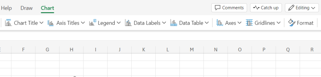
Excel also proposes you further customize your new chart by adding gridlines, labels, and bar colors with the formatting tools.
You can continue adding elements to your chart by clicking the chart area on the design tab at the top of your navigation bar. Here you will be able to change axes titles, date labels, gridlines, legends, and more.
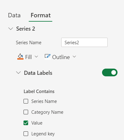
You can also visualize duration values, category names, or some other data right on your timeline.
For example, to display duration, go to the Series section in the Format pane. Activate the Data Labels option by clicking on it and then choose Value. It will be displayed on each bar.
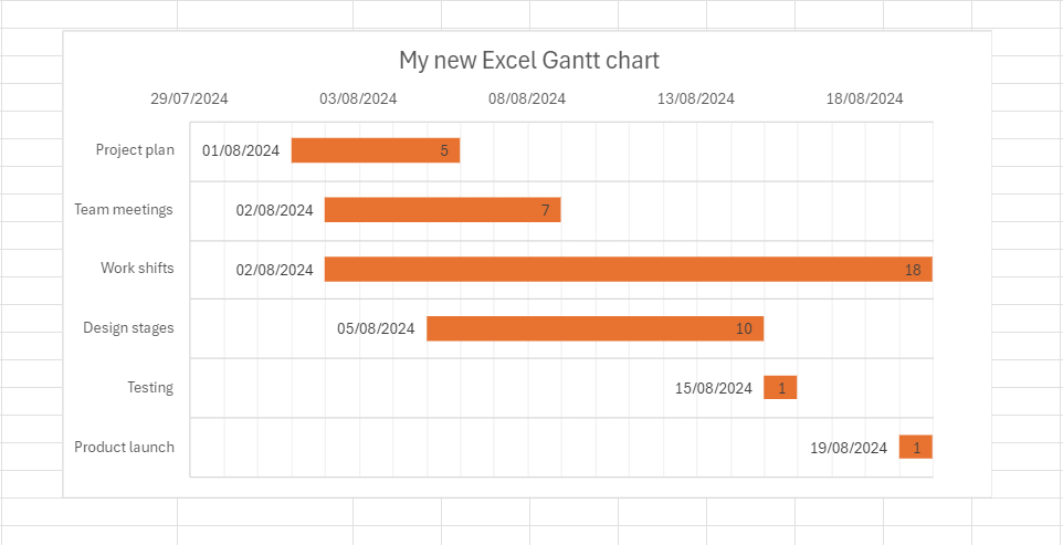
Now it’s time to check it out.
You get a nice Gantt chart in Excel, and all the steps you’ve taken don’t seem so complicated anymore.
To conclude this brief tutorial, it’s worth mentioning that even though Excel has no dedicated option for a Gantt chart, you still can make one without extra means.
However, is this enough for your project or do you need more functionality?
From the familiar Excel capabilities to a more powerful tool
Everything would be fine with a Gantt chart in Excel if it weren’t so basic and limited.
The truth is that such a diagram could be more convenient and flexible to work with. However, the Excel version only handles simple tasks and dates.
If you need to add new tasks or change durations, you’ll need a better solution.
This is not just a subjective opinion, but a fact confirmed by many users.
One of them is Kowsyap Pranay, a software engineer at MSRCosmos LLC, a global IT services company. He claims:
Excel only provides basic data visualizations such as graphs and charts, so creating more complex ones is a challenge. Performance tends to be slow when attempting to open large workbooks. Furthermore, sharing documents with others is not easy in this.
Certainly, some managers choose simple solutions but most specialists prefer improving their skills and providing teams with new opportunities. Therefore, discussions related to project management software vs. Excel are pretty relevant in a professional environment.
Often these discussions arise on the importance of just one feature – planning.
And this is not surprising since this feature is widely applied in the PM environment.
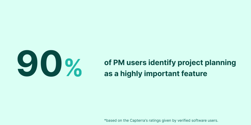
According to Capterra, 90% of project management software reviewers identify it as a highly important feature (2023).
The experts of the Digital Project Manager also called project planning based on a Gantt chart one of the critical functions of modern project management software.
Luckily, when looking for the best Excel alternatives to create a Gantt chart, you don’t have to look far as there are professional platforms based entirely on this diagram.
One of the best PM solutions for this purpose is GanttPRO.
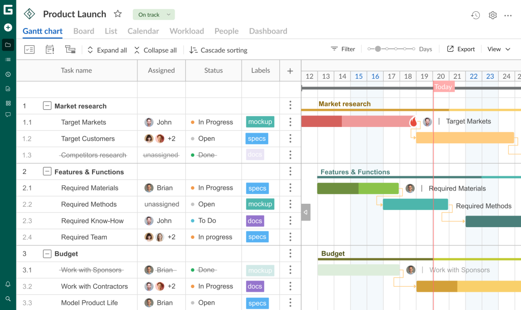
The powerful Gantt chart maker has gained trust among project management professionals worldwide.
It allows for creating interactive diagrams with advanced task planning and resource allocation. They give project teams a complete visualization to schedule, organize, assign, and monitor work tasks and assets with ease. PM professionals also use GanttPRO to improve time management, deadline control, internal and external communication, progress tracking, and more.
Lloyd Stephens is among these professionals. The global operations director at Supernova, an E-Commerce company, considers GanttPRO an excellent option:

GanttPRO has hands down the best Gantt chart functionality. It works just the right way: it’s got the correct dependencies, a nice work breakdown structure, and it works smoothly. It outperformed the competition for all the needs we have and made it the clear leader.
Now it’s time to share the great capabilities of GanttPRO to realize how multifaceted a Gantt chart may be and how easily it can be built with a professional tool.
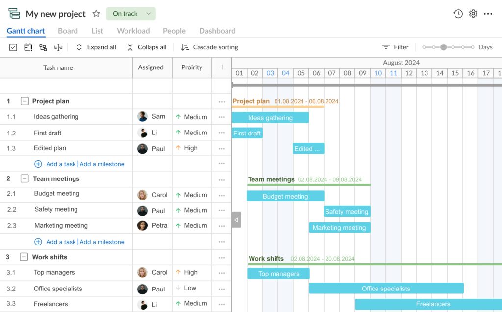
How to create a Gantt chart in GanttPRO
Creating a visually appealing Gantt chart in GanttPRO is a simple and clear process that can be realized by any user, from a student to a construction team foreman.
Let’s explore the simple steps that will help you plan and manage projects with GanttPRO Gantt chart maker.
- Create a new project and fill it with tasks.
- Add logic to your chart and structure data.
- Care about resources and workload.
- Visualize task dependencies and identify milestones.
- Apply more advanced project management features.
1. Create a new project and fill it with tasks
The first step you need to do on your way to building a stunning Gantt chart is to register in GanttPRO by entering your email or signing up with Microsoft, Google, Facebook, or LinkedIn.
If you are already a GanttPRO user, log in and find the Create new project button in the top left corner of your page.
Click on this button and you’ll see the options Create new project and Create project portfolio.
Choose the first option and start filling in the necessary info in the settings, which you’ll see in the appeared window.
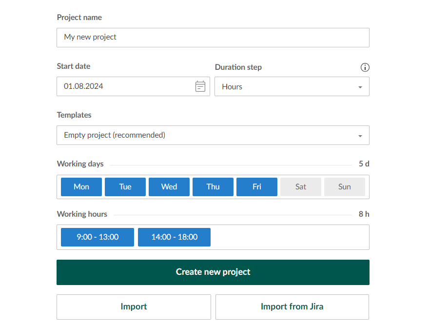
By the way, you may choose from the ready-made Gantt chart templates there. You’ll be able to pick up a template option for construction, software development, consulting, marketing, event planning, education, and more.
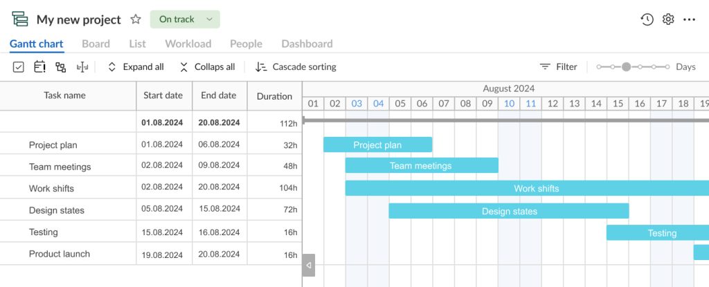
Your new project has been created.
Here you can easily visualize all your tasks, their start and end dates, and duration as you did in your Excel chart.
2. Add logic to your chart and structure data
The good news is that in GanttPRO, it’s possible to systemize project activities using a handy work breakdown structure (WBS).
By applying this helpful functionality, you can add subtasks and build the required hierarchy to make your task list logical and clear.
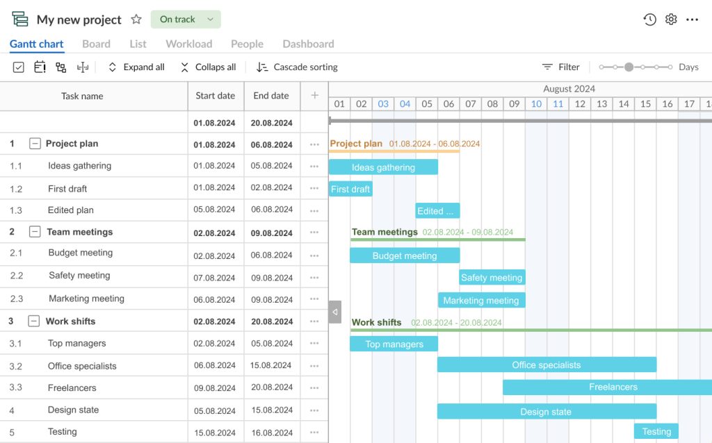
You can display required fields to the right of task titles. They will make your project visualization even more convenient.
If needed, you can hide your start and end dates or duration fields or replace them with such options as assignees, status, priority, estimation, comments, etc.
Creating your own fields is also possible.
Reliable Gantt chart software
Plan and manage projects easily with an online Gantt chart.
Sign up for free3. Care about resources and workload
Resource management is also a strong side of GanttPRO.
The diagram may reflect all the assets needed for your project management and completion.
A couple of clicks will let you assign the required resources to the defined tasks (personnel, materials, vehicles, costs, hardware, etc.).
You can invite and manage people and virtual resources here, choosing their working time units, costs, and rights.
The workload feature will help you control how your colleagues are loaded with tasks. If someone in your team is overloaded, you’ll see the red human icon near the overloaded assignee.
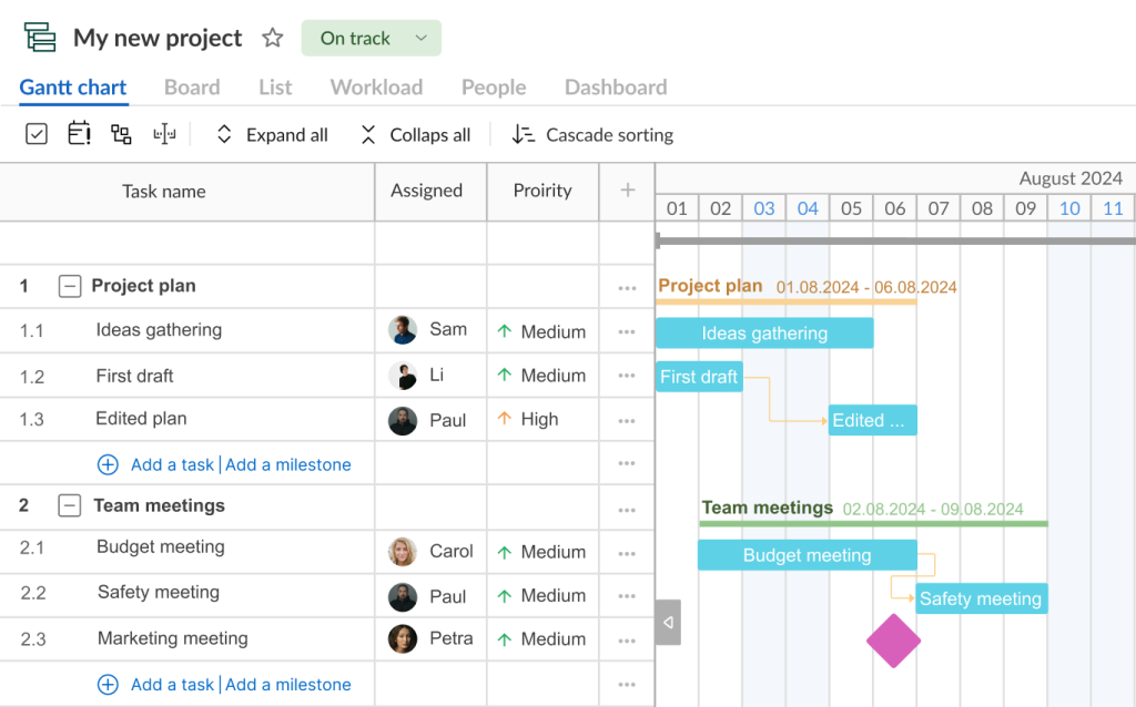
4. Visualize task dependencies and identify milestones
One of the cool features that distinguishes a Gantt chart in GanttPRO from the Excel chart version is the ability to link dependent tasks.
GanttPRO allows for setting task dependencies using a handy drag-and-drop functionality or using task settings.
For example, the end date of one task may give a start date for another one.
In case you need to visualize significant moments or events in your project, you may place milestones on a timeline. With this feature, you’ll never lose important work points.
5. Apply more advanced project management features
To make your Gantt chart more informative and dynamic, you can use robust project management features available in GanttPRO.
Below is a list of these features:
- Time tracking.
- Deadline management.
- Budget control.
- Risk management.
- Progress tracking.
- Detailed reporting.
- Collaboration functionality.
- Ready-made templates, and more.
Well, it seems that with such wide capabilities, a Gantt chart in GanttPRO can quickly become your trustful ally and a strategic lever in a competitive PM environment.
By the way, if you have a project in Excel and want to transfer it to GanttPRO, the solution is also on the surface.
Fortunately, GanttPRO allows you to quickly get a Gantt chart from cvs in minutes. It means that you can transfer all your tasks and data from the Microsoft solution and continue working in more comfortable and safe conditions.
The following video contains the details:
Find out how to create a Gantt chart in Excel or try a more powerful solution for this purpose
Microsoft Excel can be used for generating a Gantt chart that displays simple tasks and dates.
However, the steps for constructing such a diagram are not straightforward and convenient. Sometimes you will need additional modifications to avoid mistakes and get the right chart display.
If you still decide to take time and effort to create such a chart, then follow these steps:
- Making a table with tasks.
- Creating a Gantt chart using a stacked bar.
- Formatting the stacked bar chart.
- Changing the order of tasks.
- Improving the Excel Gantt chart with additional features.
In case your project requires a more comprehensive Gantt visualization that will demonstrate tasks, durations, dependencies, milestones, and resources at a glance, you’d better try a more powerful PM software solution like GanttPRO.
With the reliable Gantt chart maker, your project activities will quickly progress, and your team will be grateful for the smart workflow visualization.
Frequently asked questions about how to make a Gantt chart in Excel
-
Although Excel doesn’t offer a built-in Gantt chart, its users can create one using free templates. Microsoft 365 subscribers have access to Gantt chart templates that provide visual reminders and color-coded categories to help you track project tasks effectively.
-
Yes, we can automate a Gantt chart in Excel by using conditional formatting and formulas. By creating a table with task names, start dates, durations, and applying conditional formatting to visually represent a schedule, we can dynamically update the chart as the data changes. Additionally, using Excel’s built-in charting tools like stacked bar charts can further automate and enhance our Gantt chart.
-
Yes, Microsoft offers several tools that support Gantt charts. Microsoft Project is the most notable, designed specifically for project management with extensive Gantt chart capabilities. Additionally, Microsoft Excel can be used to create Gantt charts, though it requires more manual setup. Microsoft Planner and project management features within Microsoft Teams also offer basic Gantt chart functionalities.
Read also
Join 1M+ project managers!
Create Gantt charts in minutes with GanttPRO and reduce time spent on managing tasks by 40%
Try for freeNo credit cards required. No obligation.