Whether you manage a project or are just involved in its implementation, you might have probably heard about or used a Gantt chart, a bar chart that visually represents a project.
A Gantt chart is usually applied in project management for task scheduling, identifying milestones, keeping track of progress and deadlines, and other similar purposes. And on many occasions, there is a need to present this chart, while reporting on the status quo of the project to the stakeholders.
Even though there is a multitude of programs to create and demonstrate presentations, the product of Microsoft Office, PowerPoint, remains one of the most commonly used worldwide.
Therefore, it is quite a recurrent question on how to create a Gantt chart in PowerPoint. To that end, we’ve compiled a small guide that addresses this issue and covers the following aspects:
- How to create a Gantt chart in PowerPoint
- PowerPoint Gantt chart template
- How to insert a Gantt chart in a PowerPoint presentation
- How to create and work with Gantt charts faster and more effectively
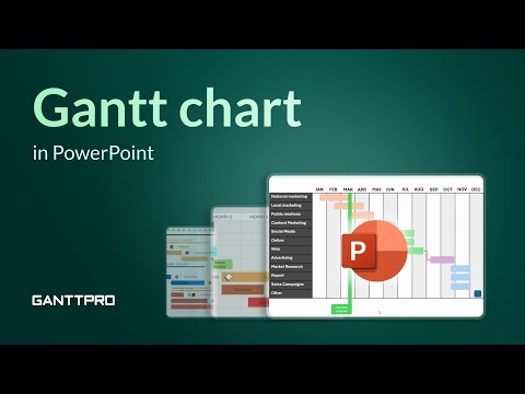
We’ve also added a corresponding video at the end of the article.
If you want to work with Gantt charts in other tools, we have also explained in our previous step-by-step guides how to make a Gantt chart in MS Project, how to create a Gantt chart in Excel, how to do it in Google Sheets, and even Word.
How to create a Gantt chart in PowerPoint
So, let’s see how to make a Gantt chart in PowerPoint (incidentally, you may recognize the following steps if you’ve ever explored how to create a project timeline in PowerPoint).
To start with, add a new slide in your PPT and choose the background color that will be contrasting with your chart. In my case, I’ve chosen a plain dark one from PowerPoint, but you can also use predesigned PowerPoint background templates.
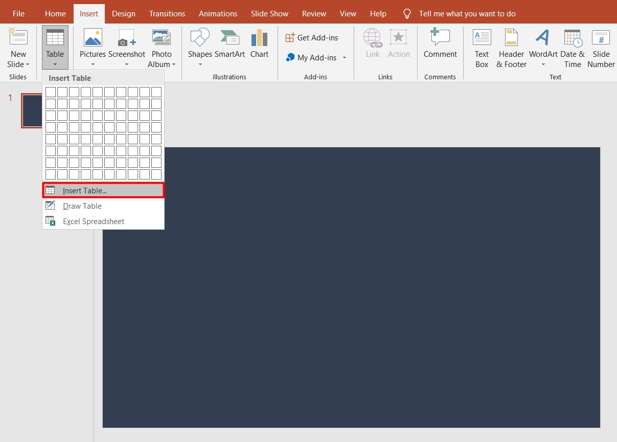
Then go to Insert → Table and select Insert table. Let’s set 13 columns (12 for the months and 1 for the tasks) and 1 row, and click OK.

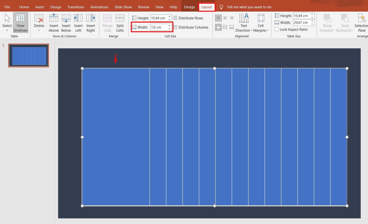
Once you see 13 columns on your slide, increase their height for the full screen and the width for the first column. To do that, you can go to Layout and then select Width and insert the value. In my case, it will be 7,6 cm.

Now that we have the table, let’s work with the visual appeal of the table. Here, you may select all the columns and go to Design and select the smallest width for the borders, grey color in the Pen color and select All borders for showing all the borders.

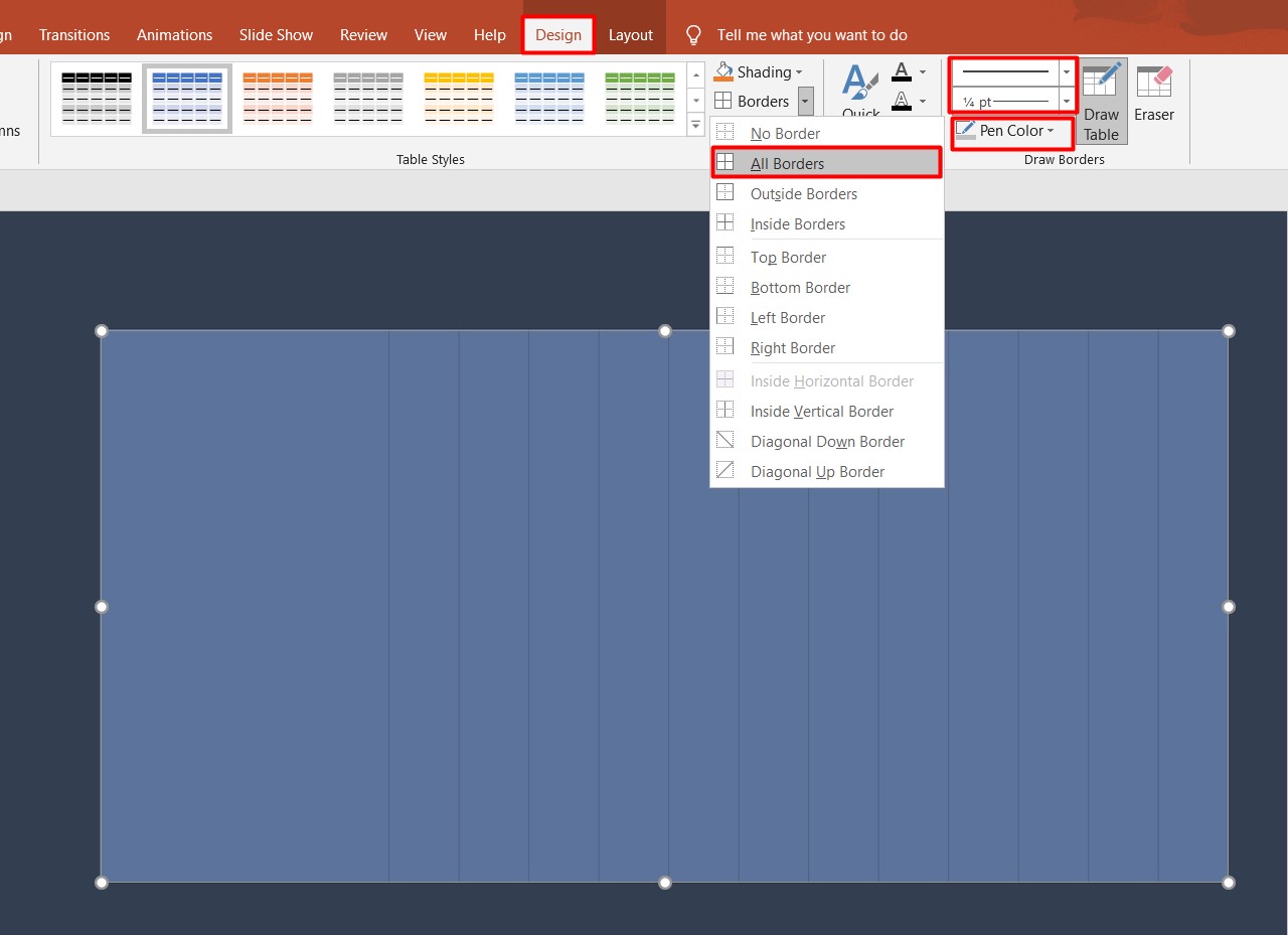
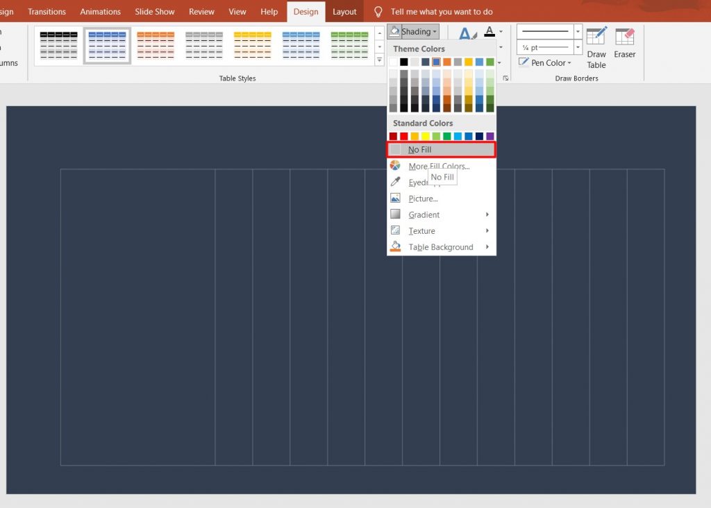
You can also select Shading and choose No fill so that your table does not have a background color.

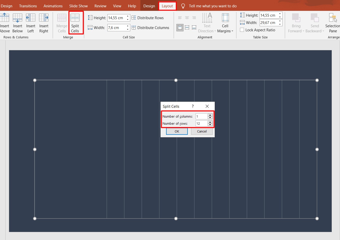
Now, let’s go back to the technical aspects of the chart. Here we have to split the first column into multiple rows. For that, select the first column and go to Layout → Split Cells and choose the number of rows depending on the number of tasks you have. In my case, I choose 1 column and 12 rows.

Now you can insert tasks into these rows. You can change the text color, alignment, and other attributes according to your preferences.

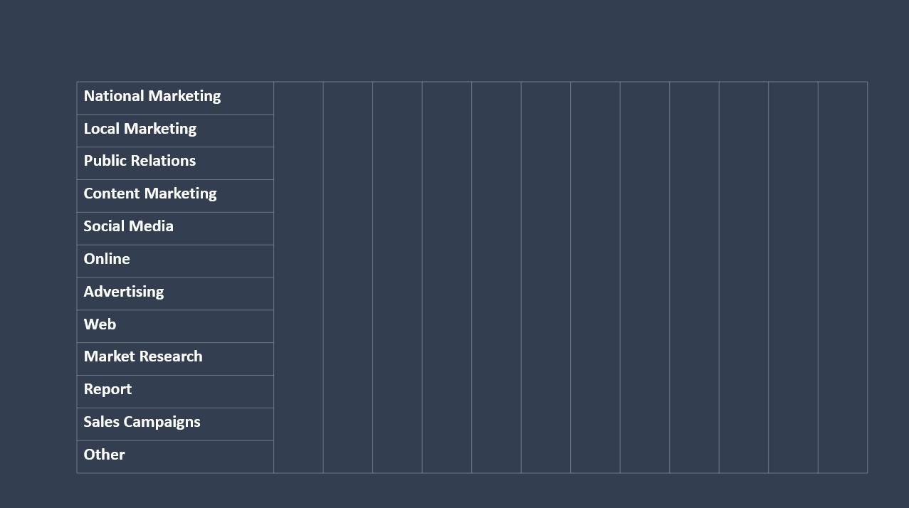
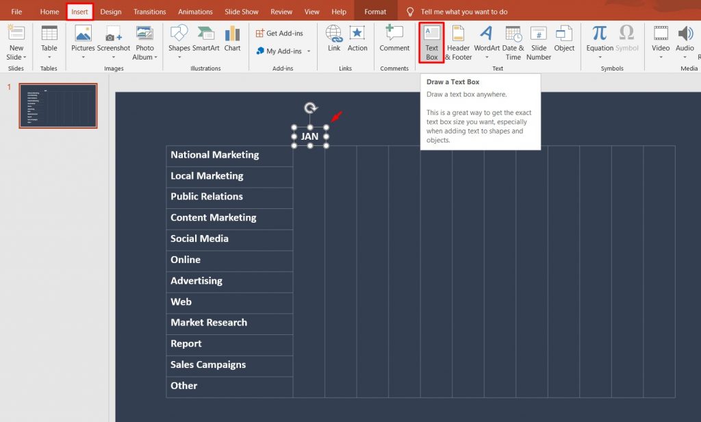
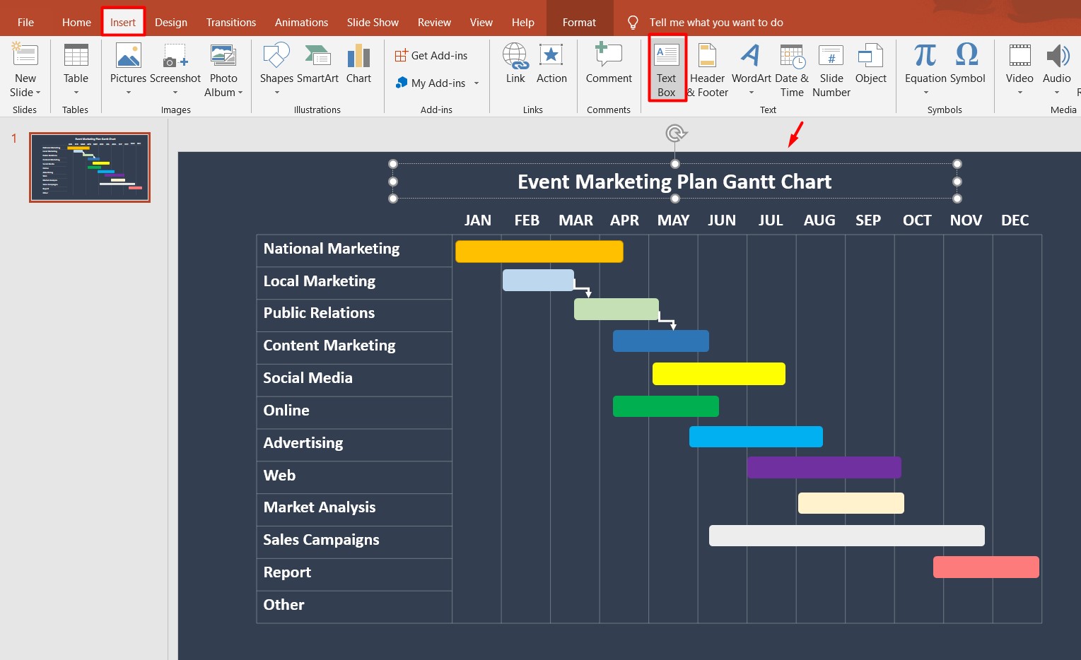
Once we have filled all the rows, we need to add months on top of the table. For that, go to Insert → Text Box and just insert the abbreviation of the first month ‘January’ above the first column, adjusting the font size and alignment to your table. Then you can press Ctrl+D and copy this for the rest of the rows, changing the abbreviated months accordingly.

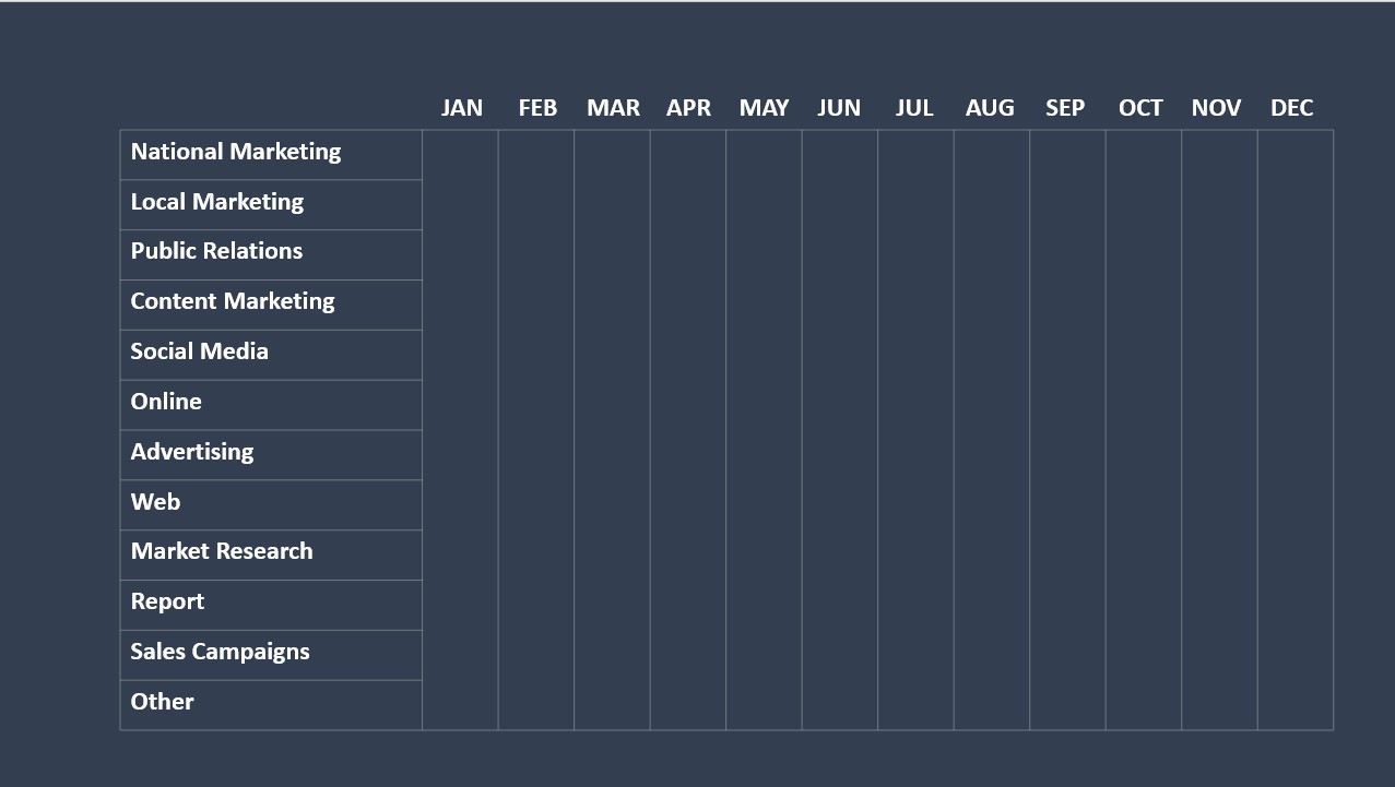
You have to get a table like this:

Now it’s time to start adding the timelines. To do that, you have to go to Insert → Shapes → Rectangles.

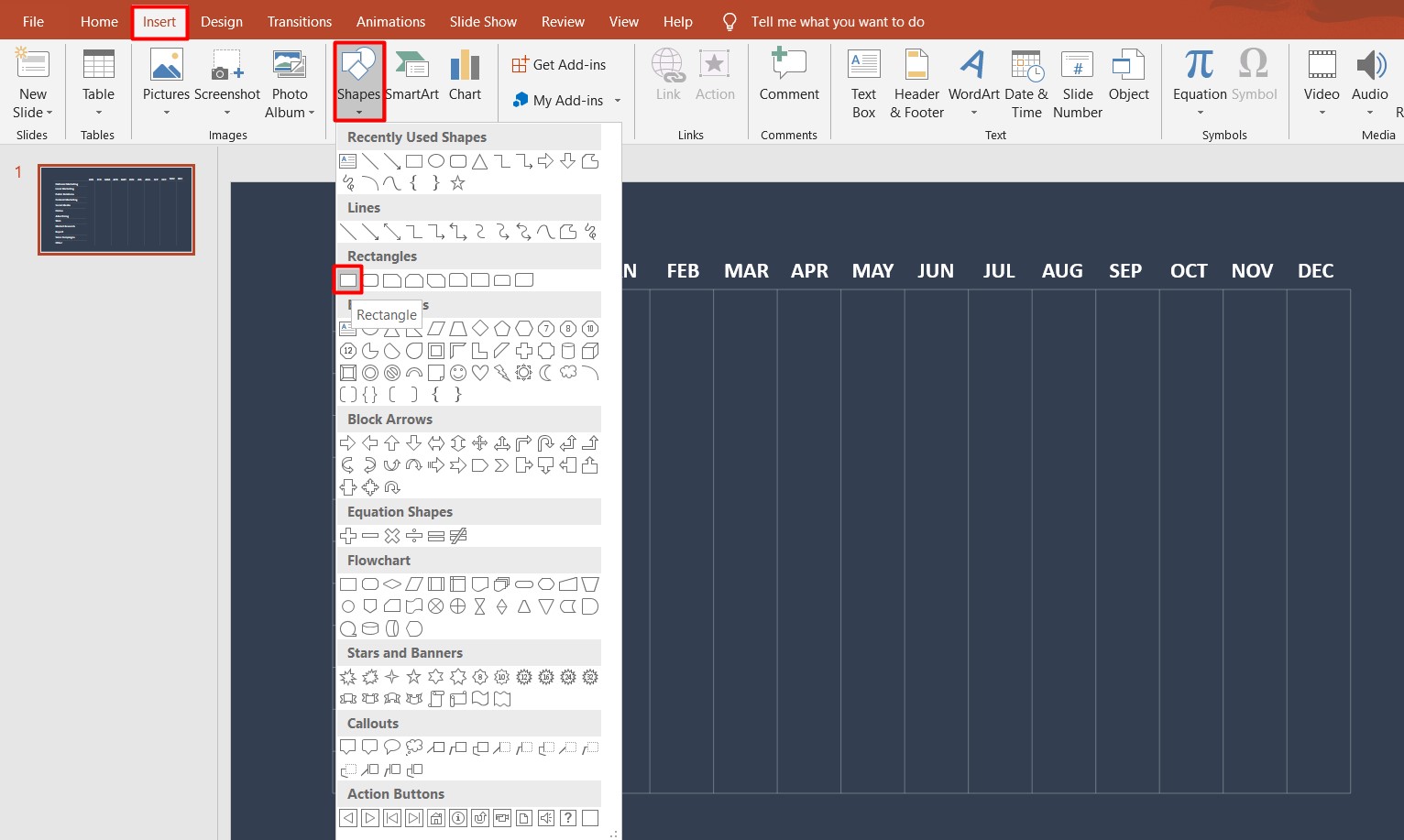
Here you can add rectangles for each task considering the duration, end and start dates of the tasks. You can also select different colors for the tasks to differentiate them somehow. Besides, you can take the same steps to show dependencies between the tasks.
Go to Insert → Shapes → Lines and choose the connector you want.

If necessary, you can also add the title to your Gantt Chart. For that, go to Insert → Text Box and add the title.

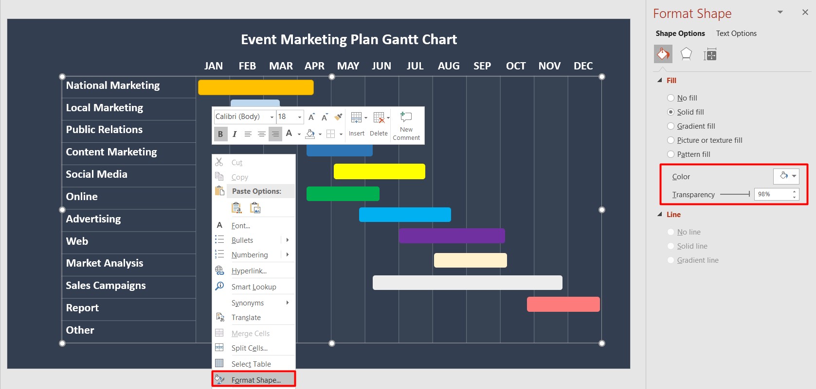
For your convenience, you can also add some formatting to differentiate the months’ columns. For example, you may select the column, do right click and choose Format Shape. Choose a white color and set 98% transparency.

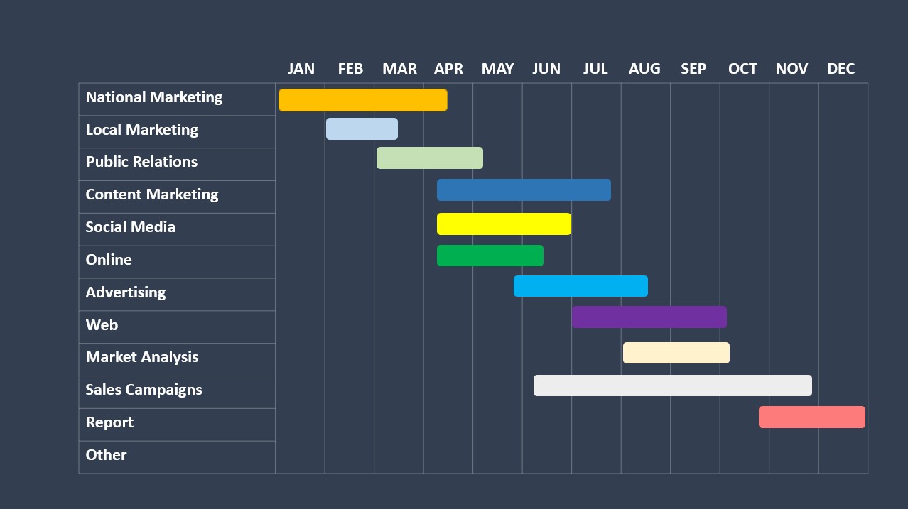
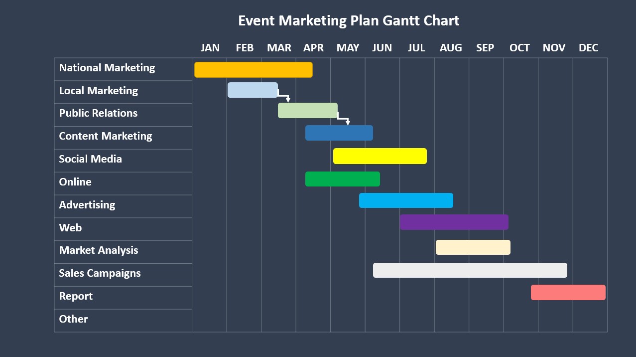
For now, you will have something like this:

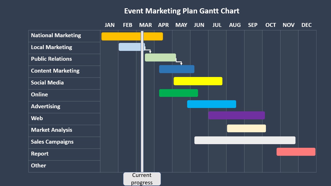
Here is also what you can do to track and show the progress on the Gantt chart. Let’s suppose you are in March, you have already started working on some tasks and want to show them on your Gantt Chart.
To do that, go to Insert → Shapes → Rectangles and select a Rounded corner rectangle. Insert it below the Chart and give it a name (e.g. Current progress).
Then, again, go to Insert → Shapes → Rectangles and choose a Rectangle. Select the same color for it and place it in the center of the Rounded corner rectangle. Then select both rectangles and press Ctrl+G to group them.
After that, you will be able to slide it depending on the progress you’ve made so far. This is it. Your PowerPoint Gantt Chart is ready.

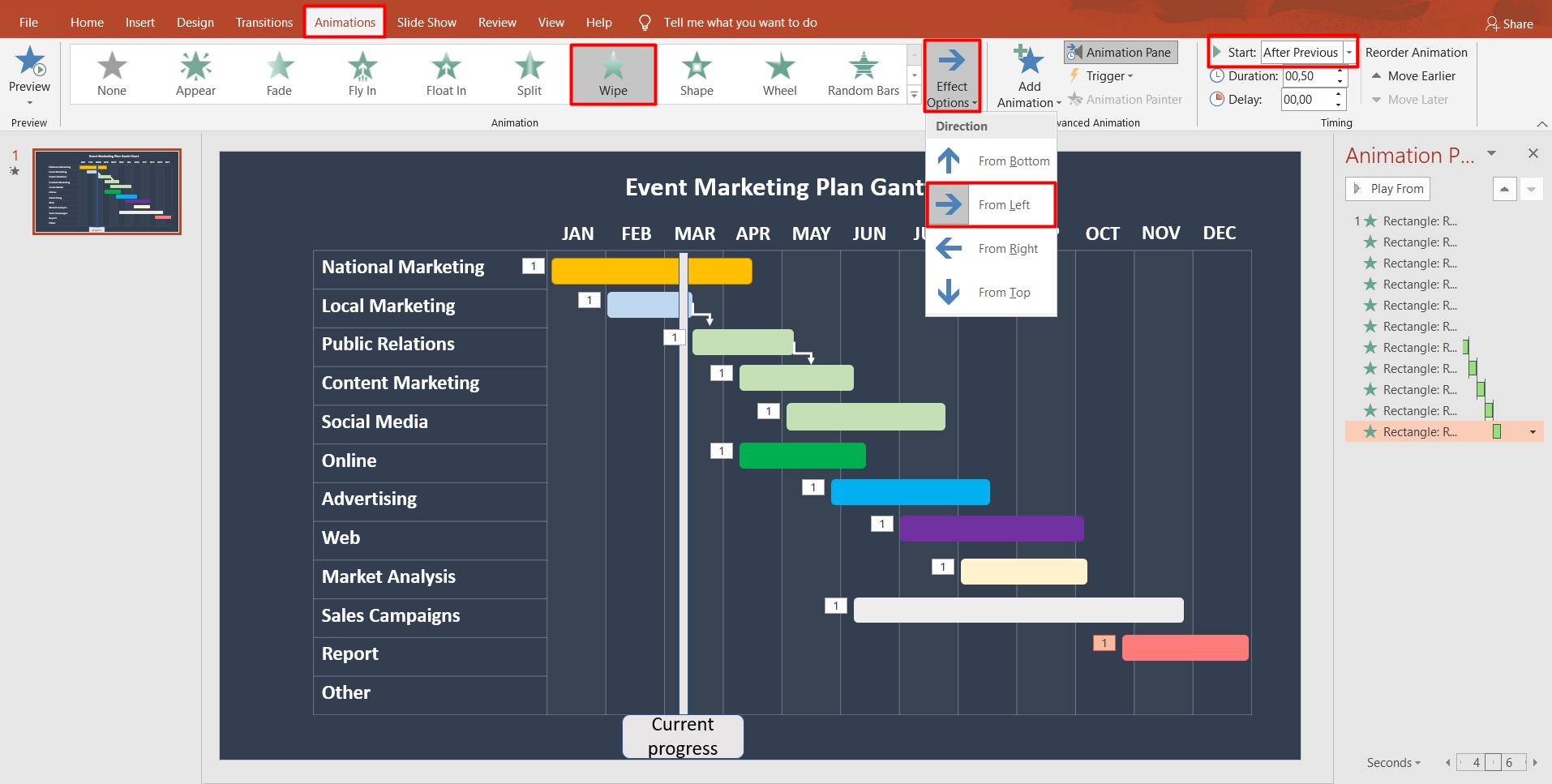
Lastly, if you want to add animation to your PowerPoint Gantt chart, go to Animations, select Wipe, and choose From left in Effect options. Apply this formatting for each row and set Start → After previous for each timeline, so that they appear in sequence.

PowerPoint Gantt chart template
For those who do not want to create their own Gantt chart in PowerPoint, there are plenty of free Gantt chart PowerPoint templates publicly available on the internet.
For example, you can find:
- Simple Gantt chart templates Powerpoint.
- PowerPoint Gantt chart template.
- Gantt Chart for PowerPoint;
- Gantt Chart PowerPoint Template.
- PowerPoint Gantt Chart Template with Dependencies.
- PowerPoint Gantt Chart Template for Software Development.
- PowerPoint Gantt Chart Template for Project Status Report.
- PowerPoint Gantt Chart Template for Project Outline.
- PowerPoint Gantt Chart Template for Project Management Plan.
- PowerPoint Gantt Chart Template for Project Timeline.
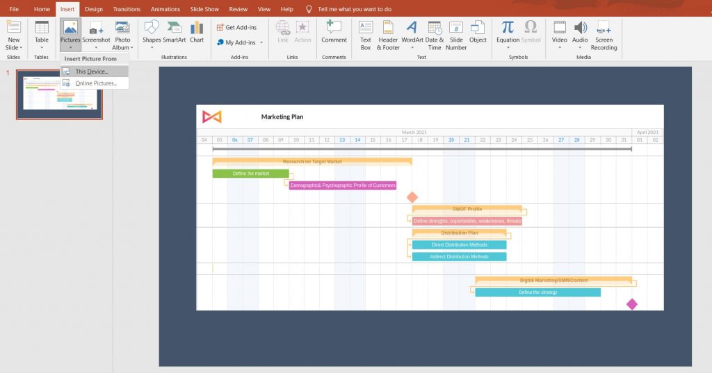
How to insert a Gantt chart in a PowerPoint presentation
It may be the case that despite making your presentation in PowerPoint, you don’t want to have a PowerPoint Gantt chart and prefer to insert a more professional complex Gantt chart.
So, if you are looking for a perfect external source that can help to create such a Gantt chart, a good fit for you may be GanttPRO, online project management software based on Gantt charts.
The whole process is simple and will take just a few minutes. First of all, create your account in GanttPRO. There you would be able to create a Gantt chart for free and enjoy 14 days of trial with all the software functions enabled.
Once you enter the app, you’ll see a ‘+’ sign at the top-left corner of the screen. Press it and select Create new project. A window like this will appear.

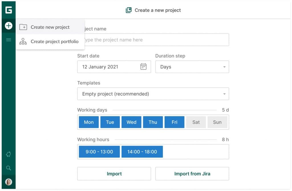
There you may introduce your Project name, start date of the project, customize working days and working hours if applicable, and then press Create a new project. There’s also an option to import a project in .xlsx, .csv, and .mpp formats or from Jira Cloud.
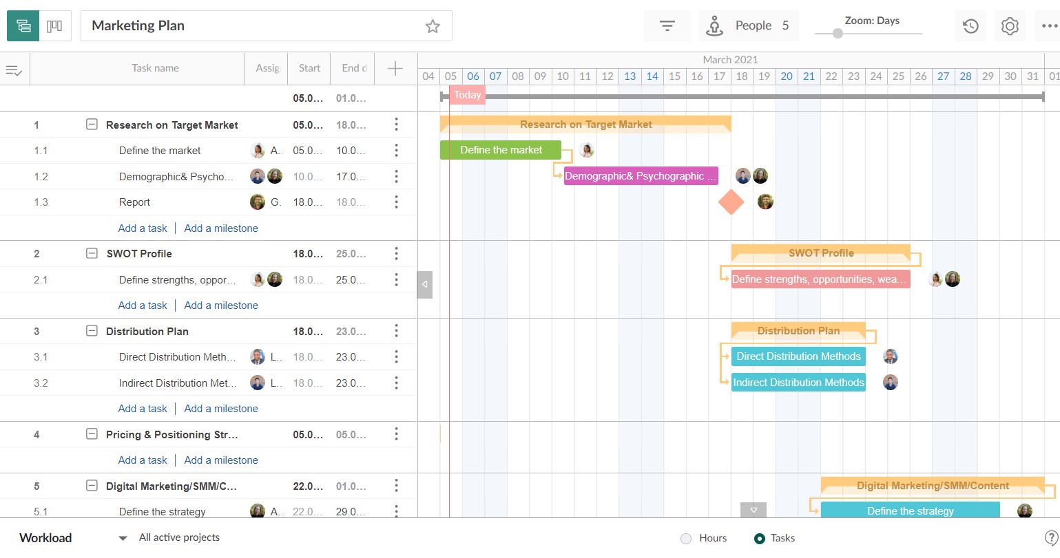
When you create a new project, by default it will be empty. So, how do you create a Gantt chart? All you need to do is to follow these four easy steps:
- Add tasks.
- Define dates for tasks and the entire calendar.
- Connect tasks with dependencies.
- Assign tasks.

Once you’re done with that, go to the upper right corner and select Export. There you can choose PNG format and your project’s details that should be included in the chart.
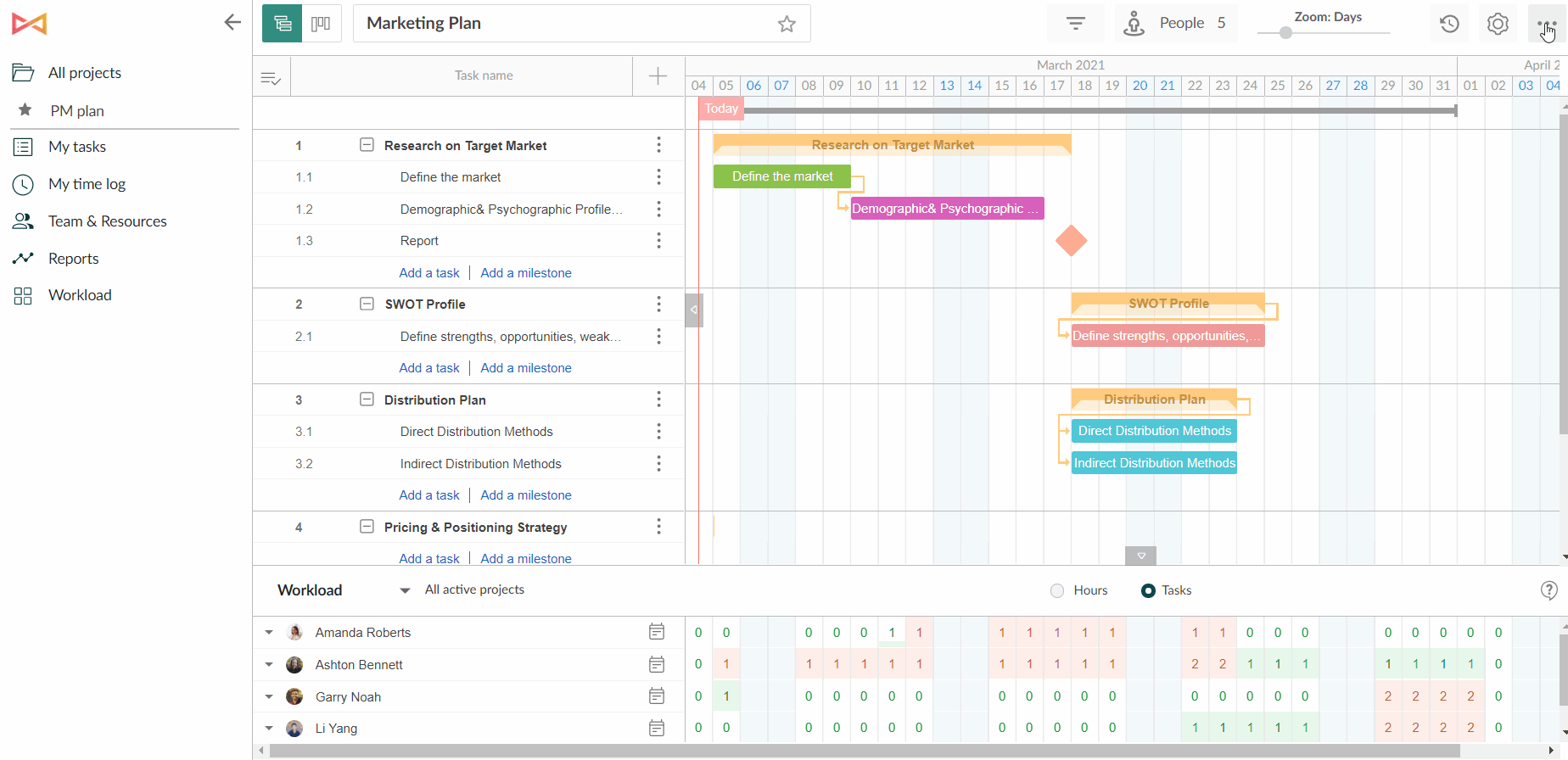

Finally, open your PPT and insert the exported Gantt chart.

How to create and work with Gantt charts faster and more effectively
One of the truly useful functions of GanttPRO, which is relevant for presentations, is that it provides advanced and convenient options for sharing the project’s progress with a Gantt chart that can include any information related to the project.
Apart from the method discussed above, there are two more options to share a Gantt chart via a private link that will show:
- a dynamic state; or
- a static state.
For a dynamic state that is set by default, you’ll share a current state of a plan where all the following changes will be also reflected.
For a static state of the project, you’ll make a snapshot of a current state of a project (ticking the box “Snapshot” in the private link window). Thus, you will share a static picture of your project taken at the moment you’ve created this link. In this case, all the following changes will not be reflected.
At the same time, if we are talking about complex ongoing projects, there is also a possibility to insert a link to your project’s Gantt chart into your PowerPoint presentation. In this case, whenever you’re going to present, your audience will get the most up-to-date state of the project, since it is synchronized in real-time mode.
Additionally, you can share a public link for the Board view.
This, indeed, is not the only great feature of GanttPRO. A great variety of functions of this cloud-based project management software will not only make your work with Gantt charts simple and quick, but also significantly facilitate the management of your projects.
GanttPRO features will help you in:
- Planning.
You can establish dependencies and task hierarchies and set milestones; set project calendar and enable auto scheduling that will recalculate everything when dependent tasks are modified.
- Task management.
The app provides you with customizable options to work with tasks; introduce bulk changes and set priorities.
- Project management.
You have options like critical path, baselines, and history changes that allow you to track the state of the project and carry it out as fluidly as it can be.
- Team and resource management.
GanttPRO embraces features that let you assign tasks, log actions, invite team members or add virtual resources and set personal values and personal calendar for each of them; and manage their workloads
- Time management.
This category includes features for keeping track of deadlines, defining the duration for your tasks or setting the estimated time; tracking time spent on tasks by team members; creating time log reports to track efficiency.
On top of that, GanttPRO provides plenty of advanced functions for costs and budget management, thus, cost management won’t be a problem either. Its elaborate collaboration functions will improve the whole team interaction, making everyone aware of things that happen in the project. Whilst the export function will let you save the charts in popular formats such as PNG and PDF, and share them instantly.
The tool’s intuitive interface and a short learning curve will allow you to create your first project in a matter of minutes. GanttPRO offers plenty of Gantt chart templates to suit most professional areas and teams to make this process as easy as it can be.
This video summarizes important steps in both tools.