


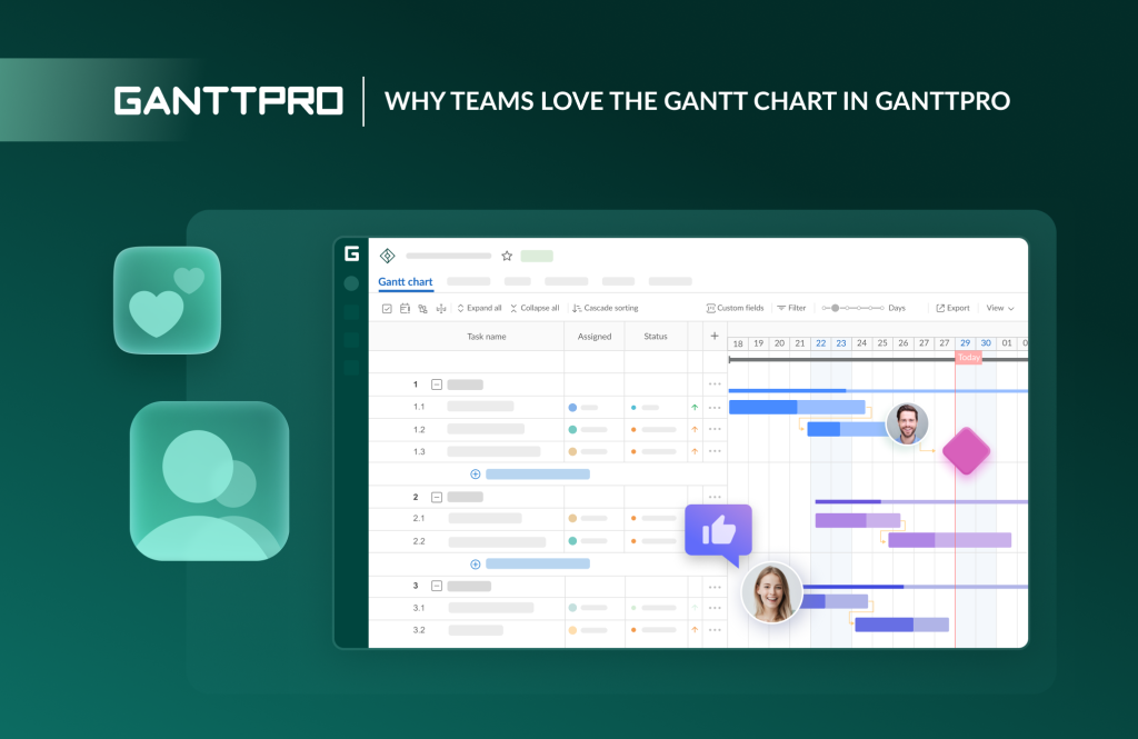
While there are many project management tools available, GanttPRO stands out for its professional and visually appealing Gantt chart. It consistently receives positive user feedback and high ratings on independent review platforms.
Project teams find this chart user-friendly and highly functional. But what exactly stands behind this positive attitude?
Many users note that working with the Gantt chart in GanttPRO becomes a truly enjoyable experience. Project visualization transforms from a formal necessity into a beloved process. It helps every team member see the big picture, respond to changes, and stay on top of things.
This article explores the unique features and capabilities of the Gantt chart in GanttPRO that make it a preferred choice for many teams.
Contents:
- Task hierarchy.
- Dependencies and milestones.
- Working with tasks.
- Gantt chart view and its customization.
Many professionals rely on a Gantt chart as a strategic tool for project planning and task management because it provides a clear visual timeline.
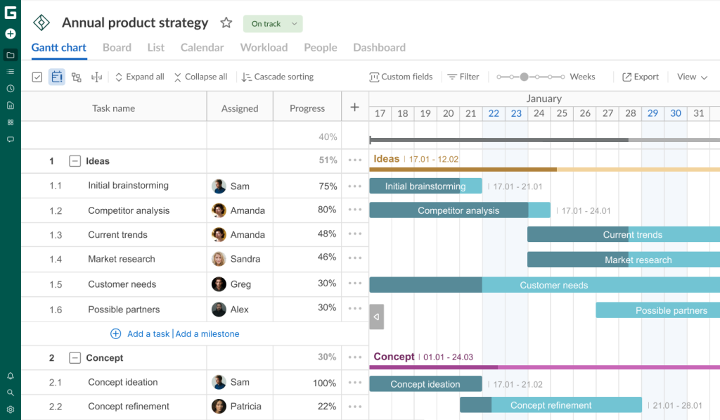
GanttPRO guarantees a professional-grade experience with this diagram. It displays a task list on the left side and corresponding bars stretched across time periods on the right. These bars show each task’s start date, duration, end date, and more.
Users highly appreciate this. One of them, Femke de Hoogt, admits:
I am a big fan of GanttPRO. It’s a very easy tool to implement when creating a Gantt chart. I can make an amazing project visualisation in the span of a few hours and proudly present it to my stakeholders.
Of course, Gantt chart project visualization is just one of the many features that contribute to GanttPRO’s popularity.
If you want to learn more about the software, check out the following articles:
- How to set up your project in GanttPRO: step-by-step tutorial.
- Tips and tricks for getting the most out of GanttPRO.
- Top 10 features project managers and teams love about GanttPRO.
- 6 top use cases GanttPRO users love.
- What you can do in GanttPRO on a free trial.
- How to organize your team’s workflow in GanttPRO.
- How to manage multiple projects simultaneously in GanttPRO.
- How to use GanttPRO for resource management.
- How to collaborate with external stakeholders in GanttPRO.
Now let’s take a look at all the benefits and strengths of the Gantt chart that make this visual planning tool a true favorite among teams around the world.
Task hierarchy
One of the main advantages of the Gantt chart in GanttPRO is the capability to work with tasks of varying complexity and visualize them using a robust work breakdown structure (WBS).
With this option, you can break down complex projects into manageable parts and set a hierarchical order to simplify work planning and tracking. Your timeline looks clear and logical to any team member or external stakeholders.
Here’s what Aine Shinners, one of GanttPRO users, thinks about this feature:
It is really important for me that the work breakdown structures and Gantt charts I create in GanttPRO are professional and accurate to industry standards. I have tried out various tools and found GanttPRO to be the easiest to use.
Now, let’s explore how project teams visualize their tasks with the help of this online Gantt chart software.
Tasks and subtasks
Tasks transform abstract project goals into certain actions that a team can execute and measure.
In GanttPRO, a visual task bar on a timeline can be presented as:
- A task. This is a specific, actionable work item that needs to be completed within a defined timeframe. It has a clear start and end point, duration, and assigned responsibility.
- A subtask. This is a child task. It appears when a task is broken down into smaller, more manageable elements. Subtasks contribute to the overall completion of a parent task.
There is also a Summary task that is displayed as a line. It reflects the start date of the earliest task in the group and the finish date of the latest one.

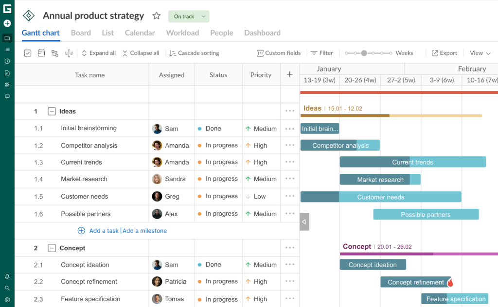
Additionally, your timeline in GanttPRO can visualize key tasks called milestones, but we’ll come back to them below.
The task structuring process in GanttPRO is as easy as pie. You can watch the details in the following video.

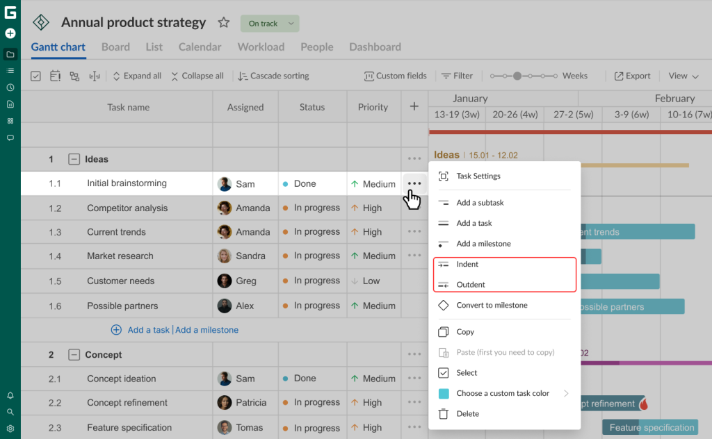
Indent and outdent
Teams trust GanttPRO because it allows for changing a task type after adding it.
It can be done by selecting the Indent and Outdent options.
With a single click on Indent, you can convert a specific task into a subtask of the previous task. This option is available in the menu that opens by clicking on the three dots button.
The indented task will be moved down one level in your hierarchy.
The reverse process is also possible. The task you outdent will go up one level in your WBS.
Dependencies and milestones
Teams that actively use the software for work planning can be assured that their activities won’t get lost on a timeline.
They clearly know how to use dependencies and milestones in GanttPRO effectively.
Nancy P., who uses the software, admits:
GanttPRO offers task dependencies and milestones, which are incredibly helpful. Having a graphical representation at the end of every progress taskbar made it very easy to visually identify the project officer responsible for the task. It’s a professional-grade tool that adds real value to project planning at any scale.
Let’s find out more details about these features.
4 types of dependencies
There are many projects where tasks are interconnected. For instance, the completion date of one activity can define the start date of the next.
GanttPRO users can set dependencies in seconds with the drag & drop feature.
All they need is to click on a small circle that appears when they hover over a task bar, drag it, and connect it with a required task. Configuring dependencies is also available directly in the settings section.

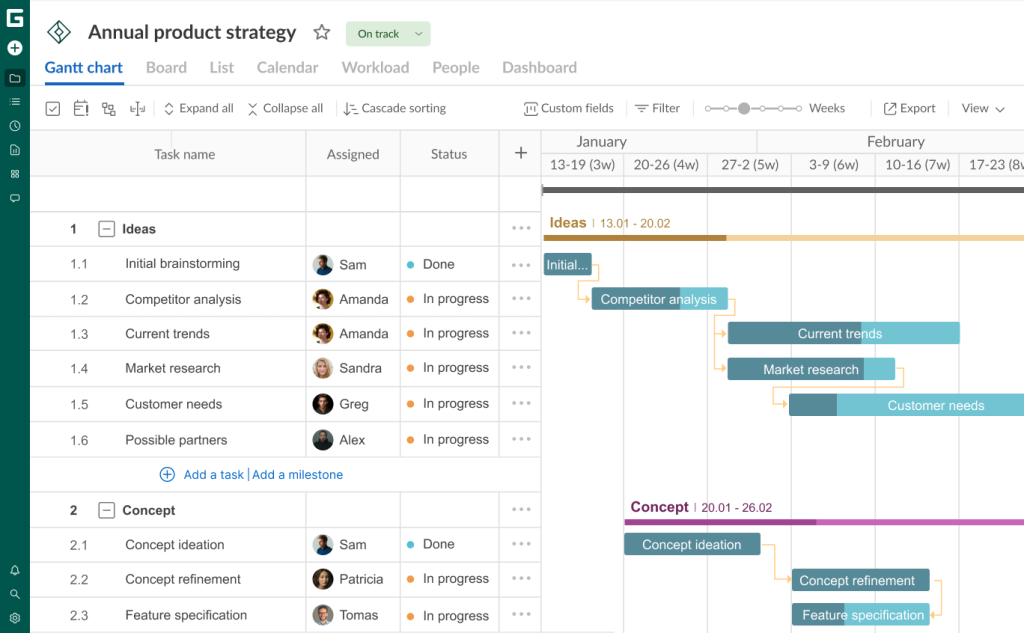
Teams consider it a great advantage that GanttPRO can visualize not only Finish-to-start dependencies, where the completion of one task determines the start of the next one. This, incidentally, is the most common type.
The program also allows for working with other, equally important, types of dependencies.
The additional types include:
- Start-to-finish dependencies. They show that a task cannot be completed until another task has at least started.
- Finish-to-finish dependencies. You need them when the completion of one task is directly tied to the completion of another.
- Start-to-start dependencies. They indicate when a task can only begin once the previous task has started.
Here’s how Iqbal Jumabhoy, CEO of BlackBook Technologies Pte Ltd, a travel app, evaluates this feature:


With GanttPRO, we place all activities on a timeline with dependencies. We create dependencies because they show us the consequences. For example, to start a new task, you need someone else to complete their tasks. So we have it all with the dependencies in place.
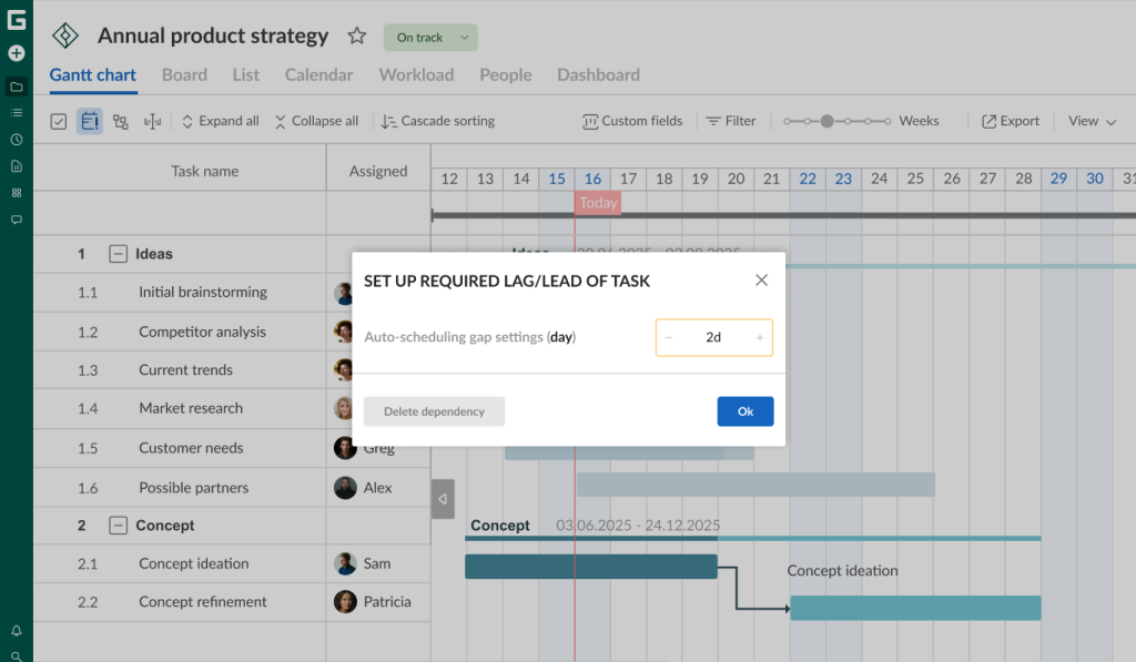
Lags and leads
A project team may face a situation when one task or subtask in a chain starts with a delay (lag time) after the preceding task is finished. Or vice versa: the following task needs to start when the preceding one is still in process (lead time).
GanttPRO allows for keeping gaps between tasks or creating overlaps between them without extra effort. It can be done even when the auto-scheduling is enabled. Therefore, if you need to move the group of tasks on a timeline, dependencies will be kept just the same as you have set them up.
The capability of setting lead or lag time is available in the window when you click on a certain dependency.
It’s possible to:
- Establish the lead time with the help of a negative value (-).
- Establish the lag time by adding values (+) to create a gap between tasks.
Certain values of the gap (hours, days, weeks, or months) can be established based on the duration step set up for your project.

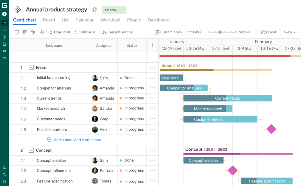
Milestones
Milestones are significant points or achievements in a project. Teams often need them to mark the completion of essential work phases, key deliverables, or important deadlines on a Gantt chart.
Unlike tasks, milestones typically don’t have duration, as they are merely benchmarks to measure progress towards project completion.
GanttPRO visualizes them as diamond-shaped checkpoints.
Working with tasks
Completing a task can be a complex and routine process. In this case, the key to success is a simple and clear visualization of a plan.
When every project participant sees the big picture and easily understands the details of each task, it eliminates misunderstandings and chaos. So, this is another reason why teams love the Gantt chart in GanttPRO.
They can create an unlimited number of tasks, assign them to a single resource or a group of resources, set due dates, dependencies, deadlines, start and end dates, and other important parameters.
Before exploring the details, check out the thoughts of Adam Hirsk, the head of product and R&D at Pacvac, a manufacturer of backpack vacuum cleaners:

What I personally use GanttPRO for is to display early details of project level tasks for various kinds of plans. For example, now I am working on a project that has around 140 tasks and the details are well handled by GanttPRO.
Drag & drop
Among other benefits, users appreciate the Gantt chart in GanttPRO for its handy drag and drop feature.
With its help, each team member can easily move tasks and change their order on a timeline.
The process is straightforward. You just need to hover over a task bar, hold it and drag it to the desired location on your timeline. The task’s start and end dates will move automatically.

As you can see, using the drag and drop feature doesn’t require any special skills.
Here’s what another GanttPRO user, Anlly Paola Guzman, notes:
The Gantt Chart in GanttPRO allows me to see the big picture and ensure compliance with critical deadlines. The drag and drop features make creating tasks, linking dependencies, and reallocating resources quick and easy, even in projects with hundreds of milestones.
Start and end dates and deadlines
The diagram demonstrates the start and end dates of each task. It means you don’t need to open task settings to clarify these important parameters.
GanttPRO allows you to select a date from your calendar or enter it manually. You can also establish the exact start and end time for a task.
It’s also possible to visualize deadlines here. They indicate that a project is on track, while even a minor delay can threaten its overall success.
You can set the desired date, and a visual deadline reminder will be visualized on a timeline on the right side of your task as a red flame sign.
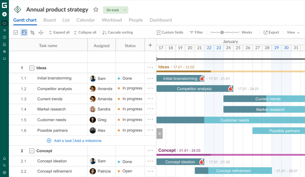
This parameter can be enabled in task settings.
The ability to set deadlines on a timeline is mentioned in the feedback of David Simiao, the GanttPRO user, involved into the construction industry:
The Gantt chart in GanttPRO looks impressive: you can drag and drop, as well as adjust deadlines and dependencies with extreme ease. This is a platform that offers total control of your schedule, but without the bureaucracy and weight.
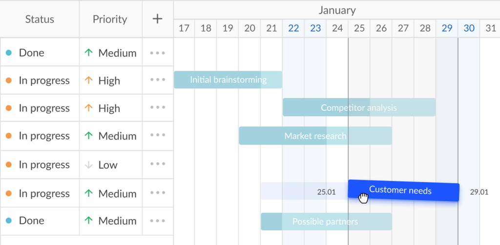
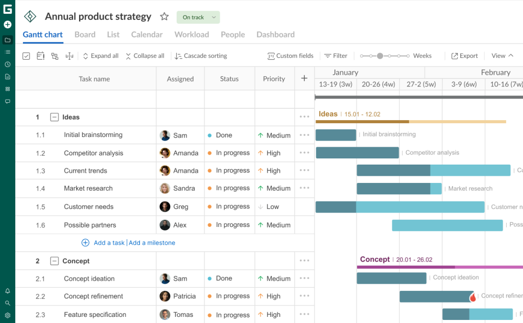
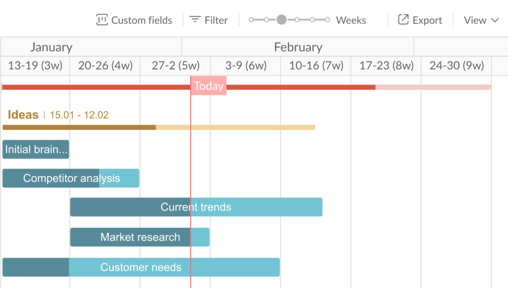
Progress
Another important visual element in the timeline system is the display of task progress. You can see it as a percentage thanks to a progress bar.
The completed part of a task is colored darker.
The scale automatically increases or decreases depending on a task’s progress and status. You can also move the progress slider manually. You’ll see range changes.
In the example below, you can see that the task called “Initial brainstorming” has a progress of 75%. This is also reflected in the standard Progress field.
However, you can input another value by clicking on the number in the task settings and then editing it.
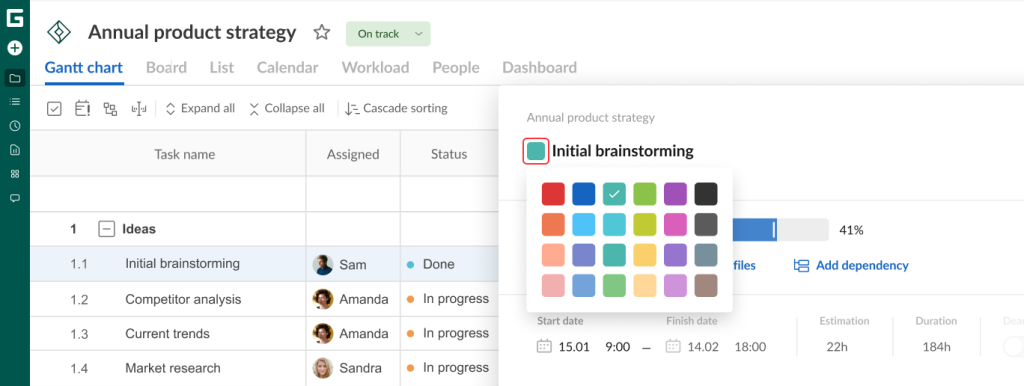
Custom task colors
Teams often change the color of their tasks on a timeline to make a Gantt chart bright and less monotonous. It also allows them to quickly differentiate activities.
This customization is available in task settings or straight from the diagram by right-clicking on a corresponding task bar and selecting the desired color option.

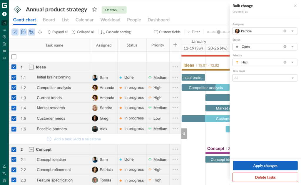
Bulk change
Teams also appreciate bulk actions in GanttPRO, which help save time on repetitive work.
You don’t need to edit tasks one by one. With the Bulk change feature, it’s possible to quickly assign tasks, change deadlines, update statuses, and more.
It is available for several standard and all custom fields.
Overdue tasks
Task deadlines can expire for various reasons. The Gantt chart in GanttPRO easily visualizes these overdue tasks.
You can view all activities that were supposed to be completed in the past, but their completion status is below 100% or they are marked as Open/In Progress. Such tasks turn red in a grid.
It helps to take the required measures to complete a project correctly.
This feature is available on Advanced, Business, and Enterprise plans.

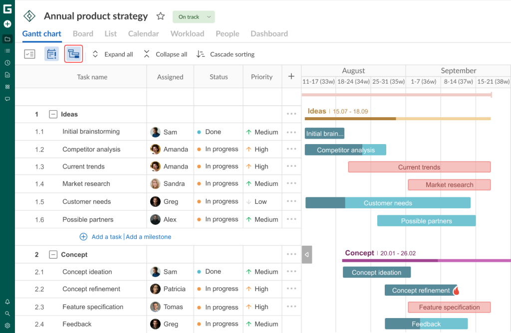
Critical path
A critical path demonstrates the sequence of tasks that users have to execute before a project ends.
This feature in GanttPRO is truly efficient for task prioritization and timely project completion.
This path on a timeline defines the shortest possible duration and highlights the activities that impact a work’s completion time. If there is a delay in one path task, the entire project will be delayed.
The feature is turned off in the default mode in GanttPRO. However, you can enable it by clicking on the corresponding icon. A critical task (or several) will be colored red.

Baseline
Users also appreciate the capability to go back to any point in a project plan and create a baseline.
They can make an initial version of a project and compare it to the current state. It helps to identify whether it is developing as it has been planned.

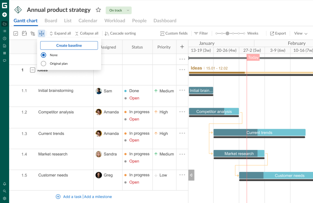
Saleem Ullah also relies on the baseline creation in GanttPRO. Here’s what this user notes:
GanttPRO shines for its balance of power and simplicity. Its interface is clean, fast, and genuinely intuitive. A critical path, baselines, and workload views make progress and resource conflicts obvious at a glance.
Collapsing/expanding
Often, teams have complex projects with a detailed work breakdown structure and plenty of tasks.
In this case, they may need the options called Collapse all and Expand all.
- If you click on Collapse all at the top of a project grid, you’ll see only parent tasks.
- If you choose Expand all, you will get the whole list with all types of tasks.
Here’s what our project looks like with only parent tasks shown.


Cascade sorting
The Gantt chart in GanttPRO also allows you to sort all tasks in a cascading manner for easier tracking and understanding of the process.
It’s easy to enable this option by clicking on Cascade sorting in the top menu.
You will see your tasks sorted by date. The earlier the start date is, the higher the task is located.
However, the feature is available for Advanced, Business, and Enterprise plans.
This isn’t a complete set of the GanttPRO diagram capabilities, as the software allows for customizing the Gantt chart view to suit personal preferences.
Gantt chart view and its customization
This functionality is also popular among many managers and project team members.
The dedicated View settings section in the upper right corner of a project grid allows users to apply customization in seconds.
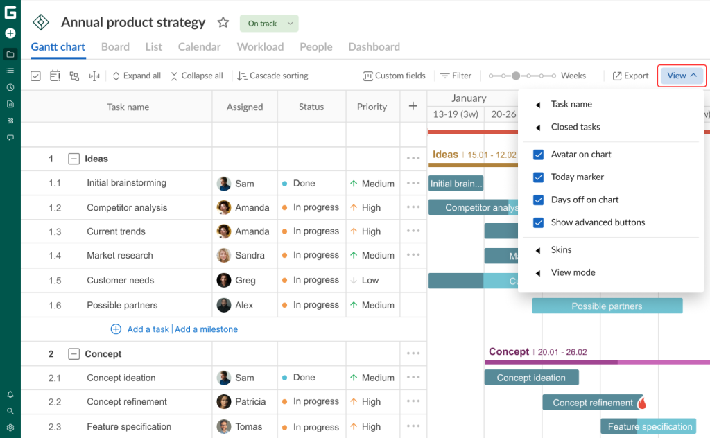
Let’s figure out the available options.
Task name
This feature lets users choose how they will see the names of their tasks on a Gantt chart:
- On the right to their task bars.
- Inside their task bars.
- Hidden (Do not display option).
For example, this is what a timeline may look like if task names are placed to the right of the bars.
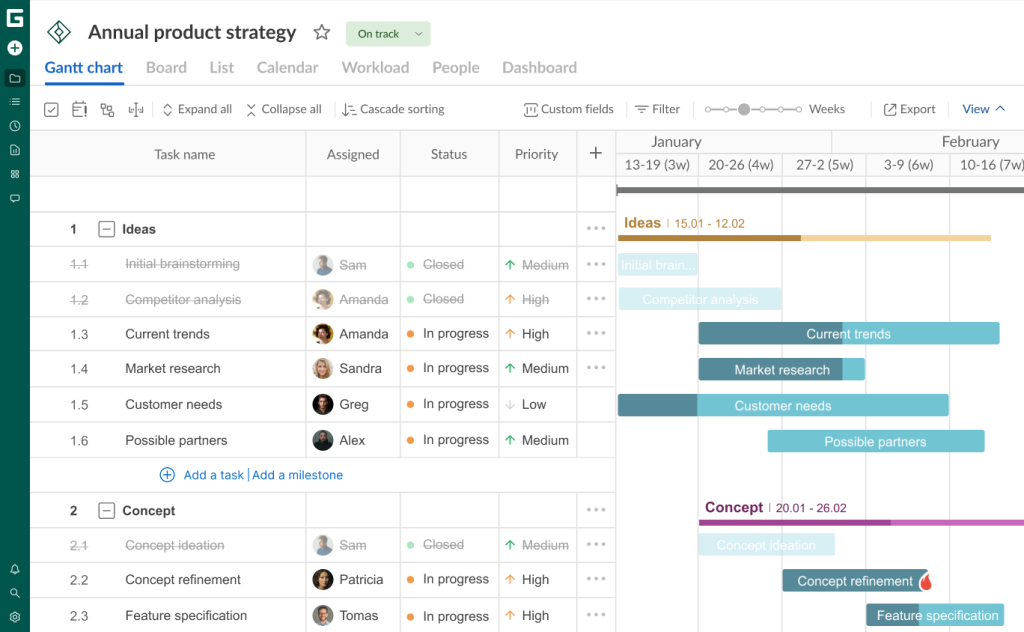
Closed tasks
Closed tasks should be highlighted on a timeline so that they cannot be confused with active ones.
GanttPRO allows for displaying tasks with the Closed status in several ways. For better visualization, you can make them:
- Strikethrough.
- Grayed out.
It’s possible to choose only one option, have two at the same time, or have none at all.
The strikethrough tasks will be applied to a project grid, while grayed out ones will be shown both in a grid and on a diagram. In this case, the color of task bars with the Closed status will be faded.
Avatar on chart
This feature allows project participants to display their avatars on a Gantt chart.
This isn’t just a nice-looking feature. It allows you to quickly see who’s assigned to a task.
If needed, the option can be quickly disabled.
Today marker
Today marker is also a significant visualization element chosen by many users. It is represented as a red line on the chart indicating the current day.
Turning on this marker, you can more easily see current tasks and the progress made in your project.

Days off on chart
The Gantt chart in GanttPRO shows only weekdays by default. But it’s easy to choose whether you want to see days off on your timeline.
They will appear on a diagram if Zoom is set to days.
View mode
There is an additional mode that also helps to customize the Gantt chart in GanttPRO. It is called View.
This mode lets you configure the size of the rows.
You may choose the following options:
- Auto.
- Compact.
- Touch.
Zoom
Project teams appreciate that they can visualize timelines in hours, days, weeks, months, quarters, or years. It actually depends on the duration and type of projects and tasks.
The configuration of a Gantt chart timeline is available by moving the Zoom slider in the top right corner.

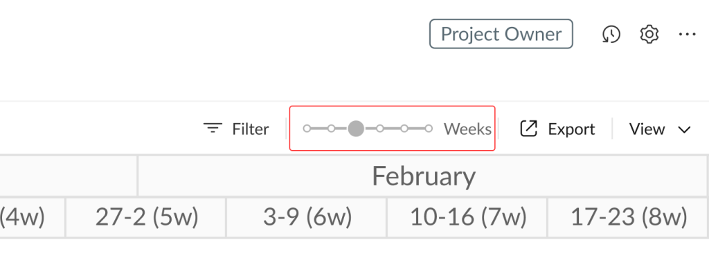
Users often mention Zoom among their other favorite features in GanttPRO.
One of these users is Rebecca Bossi. Here are her thoughts:
I find GanttPRO easy and intuitive to use. The platform is very user-friendly. I particularly liked the ability to toggle between views showing the project at weekly, monthly, or quarterly intervals.
By this point in the article, you should have a good understanding of the Gantt chart in GanttPRO.
Choose GanttPRO and join the teams that appreciate its professional Gantt chart
The project management software market is constantly evolving. It forces online solutions to become more competitive and implement features that meet the needs of modern businesses.
The Gantt chart in GanttPRO has become a reliable visual assistant for thousands of teams worldwide. Specialists in various industries trust this robust tool. They enhance their project planning and strengthen team collaboration.
The diagram effectively visualizes tasks and resources for both team members and external stakeholders, saving valuable time and making work faster and more efficient.
Join project management professionals who have already made the right choice. Try the powerful Gantt chart and become part of the thriving GanttPRO community.

Professional project management with a user-friendly Gantt chart
Visualize plans and manage projects effectively. All in one place.
Sign up for free